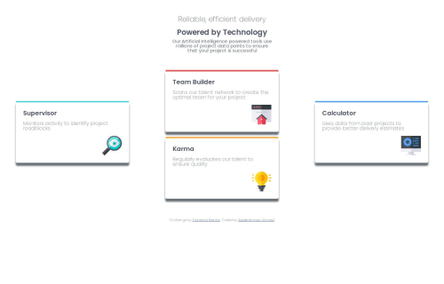
Frontend-Mentor|Four card feature section

Solution retrospective
I've became much better at using display flex and grid but there are much more to learn. Maybe next time I will add a tablet version for the website and make the shadowbox more settle.
What challenges did you encounter, and how did you overcome them?Making the grid for the desktop version was a little bit hard. But after a few videos and tutorials I came to understand how it can be done.
What specific areas of your project would you like help with?Can this layout be achieved without using transform?
Please log in to post a comment
Log in with GitHubCommunity feedback
- @VasanthakumarB
Positive Points:
The structure with the hero section and card grid is well-organized Good use of Tailwind classes for styling Nice implementation of responsive grid using md:grid-cols-3 Consistent spacing and padding patterns
Areas for Improvement:
Semantic HTML & Accessibility:
The hero section could use a <main> tag to better define the primary content Card headings should be consistent - currently using a mix of <h3> and <h4> Images lack meaningful alt text, which is crucial for screen readers Consider adding ARIA labels for the feature cards The color contrast for gray text (text-gray-600) might need checking against WCAG standards
Responsive Design:
The cards could benefit from better padding on mobile - p-6 might be too tight Consider adding a lg: breakpoint for larger screens The grid gap (gap-6) could be adjusted for different screen sizes Text sizes could be more responsive with different breakpoints

Join our Discord community
Join thousands of Frontend Mentor community members taking the challenges, sharing resources, helping each other, and chatting about all things front-end!
Join our Discord