


@pikapikamart
Posted
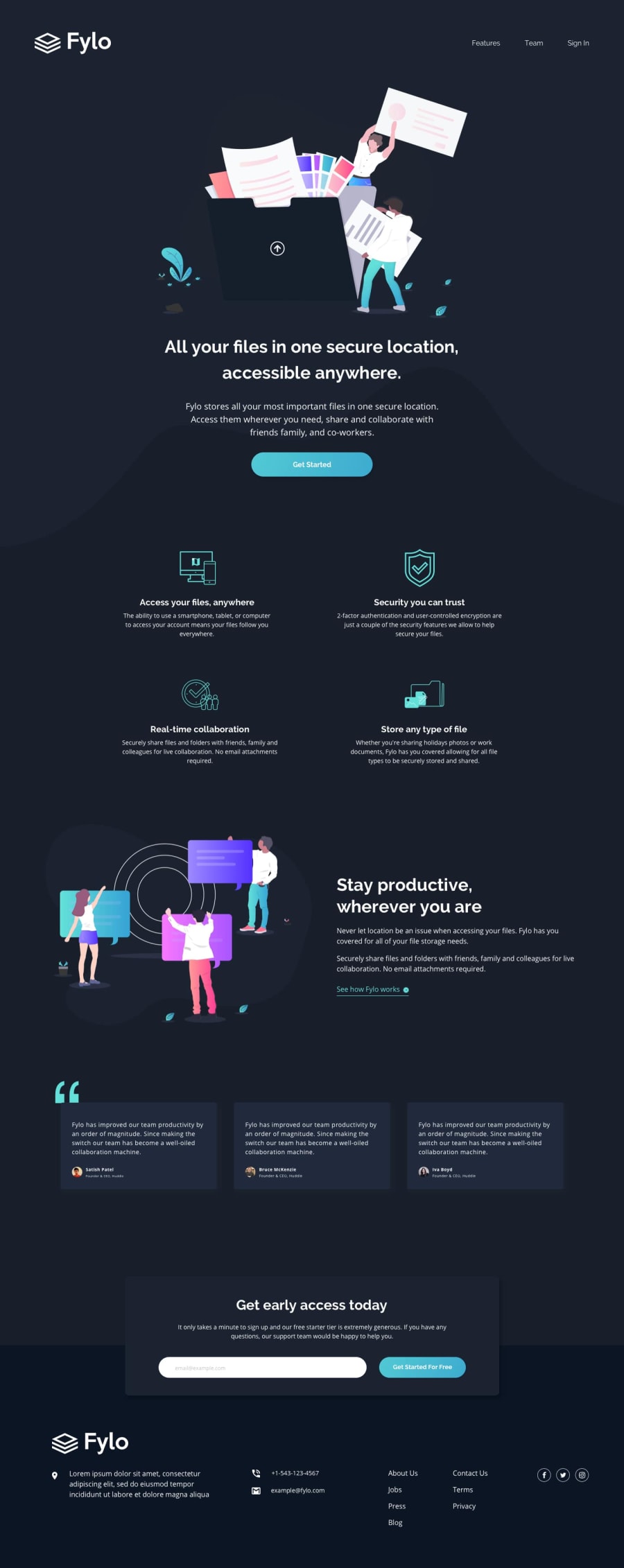
Hey, great work on this one. In terms of layout, both desktop and mobile is good.
Resizing though causes a scrollbar to appear at point 850px going down to 700px which we really need to avoid. You might want to check that one out.
In terms of UI. Suggestions would be that.
-
Colors needs to be adjusted. Right now, you are using only one color for every text content that you used. The downside is that, you can't really see what you are highlighting or giving importance to. A good example would be that, making the heading title's color more whitened than the text below it. Because this mean you are giving importance to the heading which is really important. Because using only one creates conflict in terms of importance.
-
Line-height/ spacing. This is important as well because those elements needs space as well. Adding some margins, paddings or gap is good on those. Because if just set a section with headings and text without using enough spacing, it is very hard to look at and get bored to read.
In simple terms, you need contrast
For the Markup.
-
Avoid using more than 1 h1. Use only 1 h1 per page. It may look fine but users who prefers screen reader might get an issue on those. You can use other heading tags but avoid using multiple h1 in a page.
-
I second to what @Gamygams1234 about the form. You should have used a
formelement instead of usingbuttonon that. Because a user needs to fill out something right, so a form is needs as well asinputeithertextoremail. Refactoring this will be really awesome because you need to apply some verification as well using js. Also addcursor: pointeron thebuttonelement or other element which you think is an interactive element -
On your footer sections, those links are supposed to be nested in their respective
atags. They are links right, so nesting them insideatags will make your markup more semantic and well structured. -
Lastly, maybe removing other html elements. As I can see, there is a whole lot of html elements being used that is somehow "redundant" because we can achieve the layout without using all of those. Think as if html element is limited, only use what is needed(I like this line very much, I used this once before and I think I own this hahaha).
Though it is a lot, it will be really beneficial if you could somehow apply some of those. You can see my solution on this one and if you need help, just drop it here okay^^

