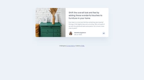
FrontendMentor_Challenge9

Solution retrospective
-Enhanced Development Workflow and Code Organization- One of the most significant improvements I've made during this challenge is in my HTML and CSS structuring. I adopted a more disciplined approach to semantic HTML, ensuring that elements are logically grouped within containers. This not only makes the codebase cleaner and easier to navigate but also significantly enhances maintainability. For instance, when designing the main content area, I clearly separated the image section from the text and author information, allowing for better control over layout and responsiveness.
-Prioritizing Responsive Design- Another key takeaway has been the emphasis on separating mobile and desktop styling. Instead of relying on a single set of styles, I now explicitly define distinct CSS rules for different screen sizes. This clear separation within the style.css file ensures that the design is truly responsive and adapts seamlessly across devices, providing an optimal user experience regardless of the viewport. This approach, centered on separation and organization, has been a fundamental shift in my development process.
What challenges did you encounter, and how did you overcome them?Google and more Google ..
Please log in to post a comment
Log in with GitHubCommunity feedback
- P@CiaoGab
Great job on the layout for desktop! The table and mobile designs break your styles however!

Join our Discord community
Join thousands of Frontend Mentor community members taking the challenges, sharing resources, helping each other, and chatting about all things front-end!
Join our Discord