Skip to content
  • Unlock Pro
  • Log in with GitHub
Solution
Submitted over 3 years ago

FullStack Product-feedback-app

express, react, axios
Chevalier Antoine•670
@SeyBoo
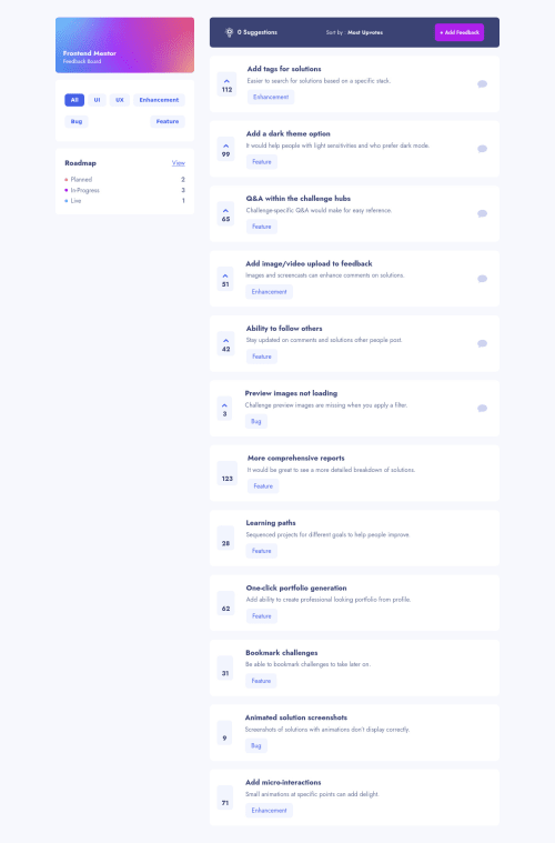
A solution to the Product feedback app challenge
View live sitePreview (opens in new tab)View codeCode (opens in new tab)

Solution retrospective


Hello i have some questions on the way i can improve.

  • I had an hard time to link different column for the backend i could have send an array but i couldn't figure out how. (So the replies doesn't work)

(The backend is kinda long to work cause heroku is pretty long to work)

Code
Couldn’t fetch repository

Please log in to post a comment

Log in with GitHub

Community feedback

  • Raymart Pamplona•16,040
    @pikapikamart
    Posted over 3 years ago

    Hi, really nice work on this one. The desktop state looks really great, site is responsive and the mobile state looks great as well. One bug I saw though:

    • When you go to mobile state and close the hamburger dropdown and if you go to the desktop state again, the sidebar is now missing.

    I don't know about your backend though, I tried seeing the repo but can't find your api directory in the nextjs pages folder. Since you are using nextjs, I mean we use different approach but you can use the nextjs api so that you will have a more compact app since the server will be in the same directory with the client-side that can do pretty much do the same thing with using express since next is using express. You could use module to use like a connect-middleware if you're a fan of it ( i'm a fan :> ). But still, hey, it works!

    Don't know if I could review the whole site since I am really having trouble looking at websites that is almost white, can't really stand it. But here are some suggestions, mainly frontend:

    • It would be nice to use the next .getServerSideProps or getInitialProps either way, it will be much beneficial so that the content will be great for seo since on this one, you are fetching it on the client-side, thus it contradicts next benefits.
    • I think the frontendmentor feedback board is just a single phrase on this and not separated text-element. Because the text "feedback board" is a great text to be heading tag since it gives information on what the section would contain.
    • Don't use span to serve as a container for those sets of button. Use div instead of ul since those are "list" of things.
    • Also, instead of using button, use a tag for each all, ui, ux, etx since they are all living in the nav tag. But if you insist on using button, then maybe adding something like an aria-pressed attribute on each of the button. You will set it to true if the user toggles this, this way, screen-reader will give extra information if the button was formerly toggled or selected.
    • header could be replaced as div on the roadmap since using header inside another landmark just treats it as a normal tag. You could header for cases like article like that, since they sometimes need a heading.
    • I think the roadmap link on this should go into another page where user can view their progress or something like that. I also would add something like a sr-only span inside the a tag so that it will describe more and not just view text.
    • Each item in the roadmap could just be a p tag and not heading tag since it the first text will be directly read when traversing using list on the screen-reader.
    • The nav inside the main tag that wraps the blue container is not needed since there aren't any navigational links in there. A div would be better.
    • For the bulb-icon, you should set a alt="" and aria-hidden="true" on the img tag since that is only a decorative image.
    • The sort-by should be an interactive element on this one.
    • I think those enhancement, feature, etc below on each of the feedback is just a tag and not an actual link or an interactive element. They just servers as guide for user on where is that suggestions has been added.
    • Those upvotes should be using button and not a span. Remember that when creating interactive components, interactive elements must be used and span is not interactive. You need to use button with either aria-label or sr-only element inside it that gives information on what the button will do.
    • Same for the upvote arrow-icon, hide it using the method above I mentioned about decorative images.
    • The heading tag for each of the feedback will be much better to make as the trigger to view the feedback. Right now, clicking the feedback container will redirect me to a feedback, but then again, div is not interactive element. You could nest the feedback's title inside of an a tag:
    <h3>
      <a href=""></a>
    </h3>
    
    • Reply-icon is decorative as well, better hiding it .

    CREATING A FEEDBACK PAGE:

    • The arrow-icon on the go back link is decorative as well, better hide it.
    • Since this is an another page, wrap the whole content inside of an main tag since that is the main-content of the page and landmark elements helps screen-reader users to navigate the site properly.
    • nav is not needed inside the form since it doesn't really contain navigational links.
    • Again, span is not best used as a container for block elements, div would be a much better choice.
    • label should not be containing block elements like h2 since it is inline. Also you could just directly use label for the h2 text so that it will be more valid and proper markup.
    • When using label make sure that the input that you are pointing to is using id attribute. Right now, those are missing which makes the label useless since the id is not present on the input.
    • It would be nice to add more validation on each of the input and not just relying on the required attribute to make sure the user adds something. Because for example, I could just remove the attribute and submit the form and can can unwanted data in your db.
    • For the category, again, span is not great as a container especially not great for using as toggle in a dropdown. You can just use select tag so that it will be more accessible or maybe a create a custom listbox if you would like.
    • The dropdown-icon on the category is decorative, hide it.
    • Same goes for the feedback detail, using a custom validation would be really nice.
    • The form is not working? Would be really nice if this was fixed or just made to work:>
    • The cancel-button should be using type="button". Remember that when a button is placed inside a form element, it defaults to type="submit". So imagine if you have a close-button inside the form without specifying type="button" clicking the close-button will submit the form. Be aware of this kind of scenarios.
    • Use button for the add feedback with type="submit" instead of input.

    For now, these only since my eyes can't really handle too much screen-whiteness. My eyesss.

    Again, great job for this one.

Join our Discord community

Join thousands of Frontend Mentor community members taking the challenges, sharing resources, helping each other, and chatting about all things front-end!

Join our Discord
Frontend Mentor logo

Stay up to datewith new challenges, featured solutions, selected articles, and our latest news

Frontend Mentor

  • Unlock Pro
  • Contact us
  • FAQs
  • Become a partner

Explore

  • Learning paths
  • Challenges
  • Solutions
  • Articles

Community

  • Discord
  • Guidelines

For companies

  • Hire developers
  • Train developers
© Frontend Mentor 2019 - 2025
  • Terms
  • Cookie Policy
  • Privacy Policy
  • License

Oops! 😬

You need to be logged in before you can do that.

Log in with GitHub

Oops! 😬

You need to be logged in before you can do that.

Log in with GitHub

How does the accessibility report work?

When a solution is submitted, we use axe-core to run an automated audit of your code.

This picks out common accessibility issues like not using semantic HTML and not having proper heading hierarchies, among others.

This automated audit is fairly surface level, so we encourage to you review the project and code in more detail with accessibility best practices in mind.

How does the CSS report work?

When a solution is submitted, we use stylelint to run an automated check on the CSS code.

We've added some of our own linting rules based on recommended best practices. These rules are prefixed with frontend-mentor/ which you'll see at the top of each issue in the report.

The report will audit 1st-party linked stylesheets, and styles within <style> tags.

How does the HTML validation report work?

When a solution is submitted, we use html-validate to run an automated check on the HTML code.

The report picks out common HTML issues such as not using headings within section elements and incorrect nesting of elements, among others.

Note that the report can pick up “invalid” attributes, which some frameworks automatically add to the HTML. These attributes are crucial for how the frameworks function, although they’re technically not valid HTML. As such, some projects can show up with many HTML validation errors, which are benign and are a necessary part of the framework.

Oops! 😬

You need to be logged in before you can do that.

Log in with GitHub