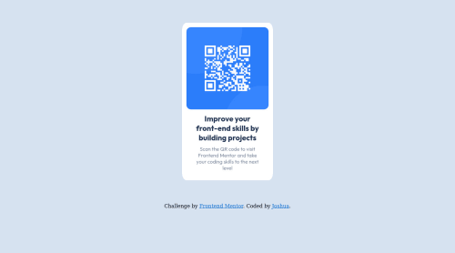
Fully responsive page using flex box and media queries

Please log in to post a comment
Log in with GitHubCommunity feedback
- @correlucas
👾Hello @joshuayumul19, Congratulations on completing this challenge!
Nice code and nice solution! You did a good job here putting everything together. I’ve some suggestions for you:
1.Use
<main>instead of a simple<div>this way you improve the semantics and accessibility showing which is the main block of content on this page. Remember that every page should have a<main>block and that<div>doesn't have any semantic meaning.2.You can reduce a big chunk of code by keep all the contents inside a single div.
3.Use a CSS reset to avoid all the problems you can have with the default CSS setup, removing all margins, and making the images easier to work, see the article below where you can copy and paste this CSS code cheatsheet: https://piccalil.li/blog/a-modern-css-reset/
✌️ I hope this helps you and happy coding!
Marked as helpful

Join our Discord community
Join thousands of Frontend Mentor community members taking the challenges, sharing resources, helping each other, and chatting about all things front-end!
Join our Discord