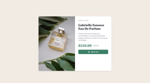
Fully responsive product preview card component using css flexbox

Solution retrospective
I'm most proud of completing the entire Product Preview Card challenge on my own — especially making it fully responsive for both mobile and desktop screens. I followed the style guide closely, learned how to use media queries effectively, and improved my understanding of layout techniques using Flexbox.
What challenges did you encounter, and how did you overcome them?One of the main challenges I encountered was aligning the layout across mobile and desktop views. On desktop, the content felt slightly misaligned or too high compared to the design, and on mobile, it initially looked too stretched or grouped too closely. I had to refine my understanding of Flexbox behavior and experiment with padding, gap, and alignment settings to get things just right.
What specific areas of your project would you like help with?I’d like help with refining the alignment of the content inside the card, especially on the desktop layout. Even after trying different combinations of padding, gap, align-items, and justify-content, the text sometimes appears slightly off — either too close together or not vertically centered relative to the image. I’ve double-checked the spacing and structure, but I feel like I’m missing a small detail that could make the layout look cleaner and closer to the design file.
Please log in to post a comment
Log in with GitHubCommunity feedback

Join our Discord community
Join thousands of Frontend Mentor community members taking the challenges, sharing resources, helping each other, and chatting about all things front-end!
Join our Discord