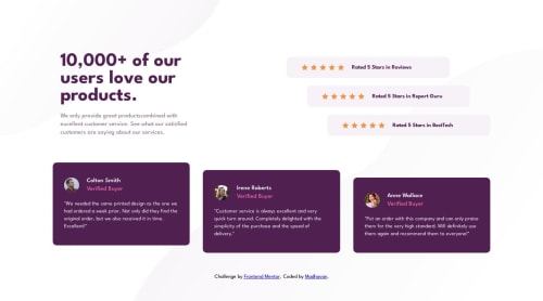
Fully Responsive Social Proof Section using Grid and Flex

Solution retrospective
I have completed this as my 11th challenge in Frontend Mentors. I am glad to accept any feedback and suggestions regarding the accessibility and the techniques that I have used to develop the webpage.
I have learned some grid properties and made use of auto-fit, min-content, max-content values in grid. I have came across the :nth-of-type() pseudo selector and also used it.
Learned to make the page more responsive using the multiple breakpoints when the page breaks
.reviews {
  grid-column: 1/-1;
  display: grid;
  gap: 3.5rem;
  grid-template-columns: repeat(auto-fit, minmax(30rem, 1fr));
  padding: 2rem 4rem;
}

.review__card:nth-of-type(2){
  margin-top: 2rem;
}
If anybody has an easier approach then I am happy to hear that and please go through the code and if you have to correct any mistakes I am happy to recive the comments.
Advance thanks for the comments 🫡.
Please log in to post a comment
Log in with GitHubCommunity feedback
No feedback yet. Be the first to give feedback on Madhavan's solution.
Join our Discord community
Join thousands of Frontend Mentor community members taking the challenges, sharing resources, helping each other, and chatting about all things front-end!
Join our Discord