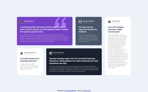
Fully Responsive Testimonial Section (CSS Grid + Flexbox)

Solution retrospective
Wow! 🤩I am thrilled to have completed this challenge. Although the design may not look exactly like the original design (in terms of typography and color palette), I am happy that I was able to make the layout as close as possible to the original.
Through this process, I learned several valuable lessons, including:
- Proper background image positioning
- The importance of mobile-first design
- How to use CSS positioning for the footer
- Utilizing Flexbox for both the image and name section, as well as centering the grid.
I faced a major obstacle🙃 during this project while making the grid responsive. However, I found a solution after reading an article on the mobile-first approach https://travishorn.com/responsive-grid-in-2-minutes-with-css-grid-layout-4842a41420fe. Initially, I tried the desktop-first approach and completed it within 30 minutes. But when I tried to make it mobile-friendly, it turned out to be a nightmare🤣. On the other hand, starting with mobile and then moving to desktop made the process easier. I hope to become comfortable with both approaches soon.
What specific areas of your project would you like help with?Any feedback is greatly appreciated! I am here to learn. I also wish to do this project in React, any suggestions are 🤗
Please log in to post a comment
Log in with GitHubCommunity feedback
No feedback yet. Be the first to give feedback on Victor's solution.
Join our Discord community
Join thousands of Frontend Mentor community members taking the challenges, sharing resources, helping each other, and chatting about all things front-end!
Join our Discord