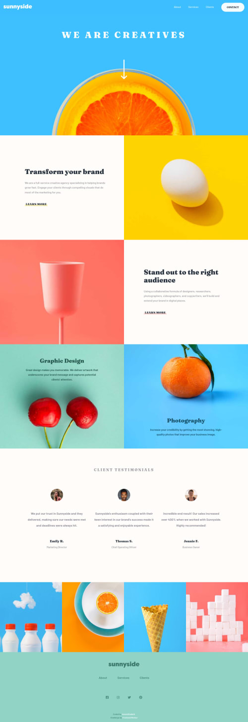
Submitted over 4 years agoA solution to the Agency landing page challenge
Fully-responsive landing page made using CSS flexbox and grid
LVL 2

@loosenthedark
Solution retrospective
Pretty happy overall with the end result, especially having managed to complete the challenge without pulling in any major dependencies (Bootstrap, jQuery etc.) 💪🏼
- CSS-wise, I've taken a somewhat fluid/hybrid approach, with flexbox for mobile and tablet and then a bit of grid on top of that for wider screens
- I decided to have a bit of fun with one of the background images on tablet and desktop by using an absolutely-positioned pseudo-element to flip it on its head 🤭
- I ditched the fixed-top nav bar on tablet and desktop, and decided instead to use a dynamic 'back-to-top' button on vertical page scroll (> 500px) to aid navigation/UX
- I'm thinking the font-sizes on tablet might be a bit on the small side, so I'll probably rejig the stylesheet at some point
- I'll also look to refactor several repeated styles (e.g. for colours) using CSS variables whenever I get the chance
All feedback welcome!
Code
Loading...
Please log in to post a comment
Log in with GitHubCommunity feedback
No feedback yet. Be the first to give feedback on Paul Harrington’s solution.
Join our Discord community
Join thousands of Frontend Mentor community members taking the challenges, sharing resources, helping each other, and chatting about all things front-end!
Join our Discord