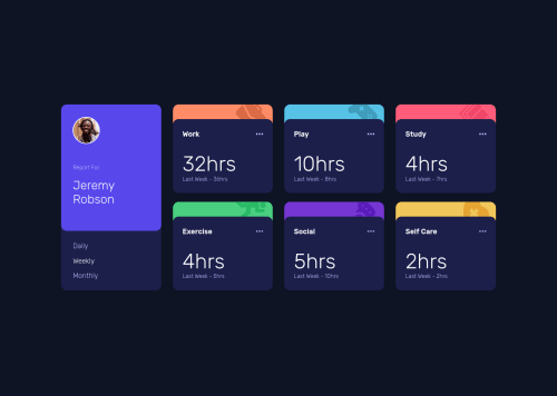
@idesmar
Posted
Congratiolations in completing this challenge, Nate!
- I assume you were trying to develop the site mobile first, however, I saw a few media queries with
max-width
. For simplicity, you can uniform it tomin-width
. - Also, since you're using SCSS. You can assign a variable for each screen size you want to work on (ie.
$mobile: 500px
,$mid-screen: 800px
, ...). - For easier positioning of the cards, you can separate the
#title_card
from the grid so it will only contain the 6 info cards. That should allow you to easily create transitions when the screen resizes (eg. 1 column on$mobile
, 2 columns on$mid-screen
, 3 columns on$full-screen
) - Simplify
grid-gap
by shortening it togap
I hope I was able to give you good feedbacks that could help improve this challenge. Happy coding and happy new year!
@nnorthway
Posted
using max-width
vs. min-width
is a thing of preference. same with using variables for breakpoints. on a bigger project, sure I would, but when I use the variables once it doesn't make it any easier, imo.
I don't see how removing the title card div from the grid would make things easier - care to elaborate?
grid-gap
used to have better support than gap
, so I'm used to using the long-hand. Probably should switch to using gap
as the default before grid-gap
loses support lol.
@idesmar
Posted
@nnorthway min-width
vs max-width
is definitely a preference. I had some problems playing with the code, though, once I introduced another breakpoint to create a better transition from desktop to mobile and for better responsiveness; and I suspect the max-width
media query to be the culprit.
The variable, I thought was needed becuase about 15 media queries was using the same min-width
.
If the #title_card
is with the other cards, creating a middle breakpoint would require either targeting it or one/some of the other cards to be re-styled rather than just re-styling the cards container. Sample code below shows how the cards are controlled by the container.
.cards {
display: grid;
gap: rem(62);
@include media(screen-200) {
transition: gap 1s;
column-gap: rem(30);
row-gap: rem(75);
}
@include media(screen-400) {
grid-template-columns: repeat(2, 1fr);
}
@include media(screen-600) {
grid-template-columns: repeat(3, 1fr);
}
}
I hope the code made sense cause there's some Sass function and @include there.
I was trying to make the page more responsive and transition better to mobile but the #title_card
and max-width
was really holding me down. Lol
That's it from me, I guess. Again, Happy New Year!
Marked as helpful