Not Found
Not Found
Not Found
Not Found
Not Found
Not Found
Not Found
Not Found
Not Found
Not Found
Not Found
Not Found
Not Found
Not Found
Not Found
Not Found
Not Found
Not Found
Not Found
Not Found

Submitted

Fylo dark theme landing page master

Hdev 215

@hemanuela

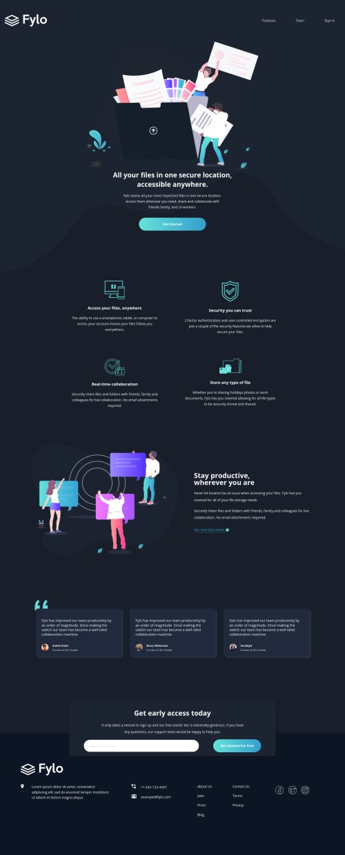
Desktop design screenshot for the Fylo dark theme landing page coding challenge

This is a solution for...

  • HTML
  • CSS
  • JS
2junior
View challenge

Design comparison


SolutionDesign

Solution retrospective


Feedbacks are welcome :)

I didn't code the error msg (input). I don't know how to do it yet ^-^'' As soon as I get it, I'll update the code.

Tks in advance

Community feedback

Aram 15

@Aram-961

Posted

for the navbar try : nav { display: flex; align-items: center; padding: 20px 8%; }

nav .logo { cursor: pointer; margin: 25px; }

nav ul { flex: 1; text-align: right; }

nav ul li { display: inline-block; margin: 0 20px; text-decoration: underline; cursor: pointer; } it will be better

Marked as helpful

0
Vanza Setia 27,855

@vanzasetia

Posted

👋Hi hemanuela!

For the error message, you can read this CSS Tricks Article about Form Validation using HTML and CSS only. If you want to see it, how it works in this challenge, you can check my solution for that.

Now, for the feedback:

  • You can import all font families once. It will make your page loads faster 🚀.
  • For the logo image, the alt value should only, the name of the company Fylo. You don't need to mention the "logo" word.
  • For the menu-nav, I recommend to use nav tag.
  • All page content, except the footer and header should be inside the main tag.
  • For any decorative images, like illustrations, icons in this case, you should leave the alt="" and add aria-hidden="true" or role="presentation" to make sure that all screen readers ignore those images.
  • Heading order is important. You have to use h2 first, so that you can use h3. For the first section, for every title (<h3>Access your files, anywhere</h3>), you shouldn't use heading tag. The purpose of heading tag is titling every section. So, I recommend to use strong tag instead of heading tag.
  • Also instead of wrapping each item with div. I recommend to use ul as the parent and for each item wrap it with li.
  • Every image should have alt alternative text.
  • For this form, I recommend to make the button type="submit" and put it inside the form tag.
<form class="subscribe-input">
            <input type="email" placeholder="[email protected]">
          </form>

          <button> Get Started For Free </button>
  • For the email and the phone number, you can use anchor tag with mailto and tel.
<a href="mailto:[email protected]">[email protected]</a>
  • For the social media icons, I recommend to wrap the each img with a tag. Since, in real website, if you click the social media icon, it will redirect you to their social media, right? In this case you can just point to https://<social media>.com.

That's it! Hopefully this is helpful!

Marked as helpful

0

Hdev 215

@hemanuela

Posted

@vanzasetia Thank you! Your tips are amazing and very helpful! I'll put in practice right now!

0

@oliveiring

Posted

It took me days on end to get done with the background image, It was definitely the harder part hands down.

0

Aram 15

@Aram-961

Posted

@oliveiring iam facing problems with the background image too :/

0

Please log in to post a comment

Log in with GitHub
Discord logo

Join our Discord community

Join thousands of Frontend Mentor community members taking the challenges, sharing resources, helping each other, and chatting about all things front-end!

Join our Discord