Not Found
Not Found
Not Found
Not Found
Not Found
Not Found
Not Found
Not Found
Not Found
Not Found
Not Found
Not Found
Not Found
Not Found
Not Found
Not Found
Not Found
Not Found
Not Found
Not Found

Submitted

Fylo dark theme landing page | Pure HTML CSS

Connor Z 5,115

@zuolizhu

Desktop design screenshot for the Fylo dark theme landing page coding challenge

This is a solution for...

  • HTML
  • CSS
  • JS
2junior
View challenge

Design comparison


SolutionDesign

Solution retrospective


Feedbacks are welcome!

I'm trying to practice components based CSS. That's why my code are kind hot mess LOL.

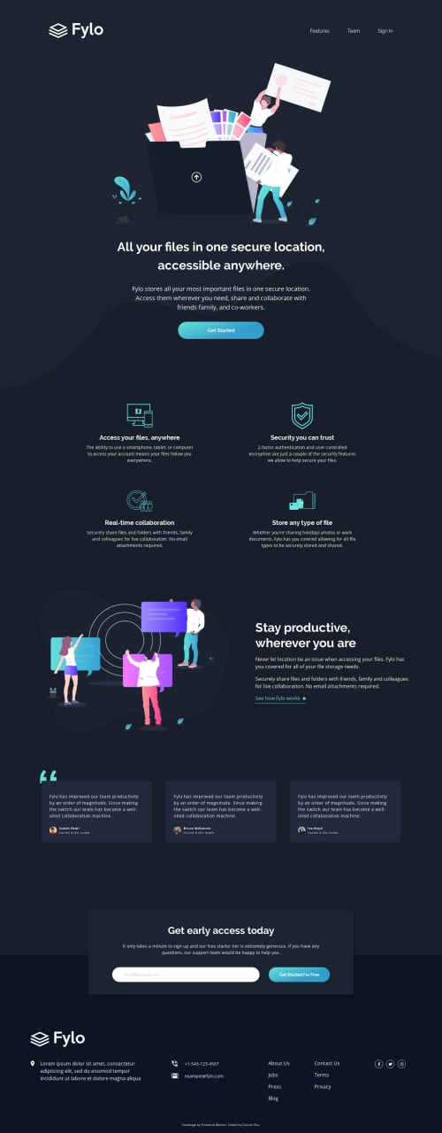
The background curve image at the intro section are kind tricky. I did it using two position: absolute sections, and then pushing margin top in the next component to make the space for the intro section.

Let me know if you have any better solution!

Thanks!

Community feedback

Ksenia 1,350

@ksenius

Posted

Hi! Good job!

I really liked the hover effects! 👍

The better solution for adding the curve image to the intro section is adding it as a background image via CSS. Thus, you'll be able to position it at the bottom of the section with the background-position property and no additional elements with position: absolute needed.

Here is a link to the CSS Backgrounds reference on w3schools.

As for component approach, I noticed that you used BEM naming. If that is so, I'd like to mention that some of your classes names are incorrect. Here is a couple of examples:

  • .testimonial_card should be .testimonial-card, because _ is used for modifiers;

  • You have .profile__avatar and .profile__image__avatar. In BEM there can't be an element of an element, but you can nest elements. So, it would be better to name the latter one something like .profile__avatar-image.

3

Connor Z 5,115

@zuolizhu

Posted

@ksenius Thank you for you suggestion! I just figured out using linear-gradient with background image can do you job haha :D.

0
Diarrah 3,418

@Diarrah

Posted

You did a great job!

The way I did it was just made a div between the header + the card container then put the curve image inside that div. Then just position:absolute, width: 100% & transform:translateY(-100%).

Maybe that helps? Diarrah

0

Connor Z 5,115

@zuolizhu

Posted

@Diarrah Yeah that sounds a good approach as well! Thanks!

0

Please log in to post a comment

Log in with GitHub
Discord logo

Join our Discord community

Join thousands of Frontend Mentor community members taking the challenges, sharing resources, helping each other, and chatting about all things front-end!

Join our Discord