Skip to content
  • Unlock Pro
  • Log in with GitHub
Solution
Submitted almost 4 years ago

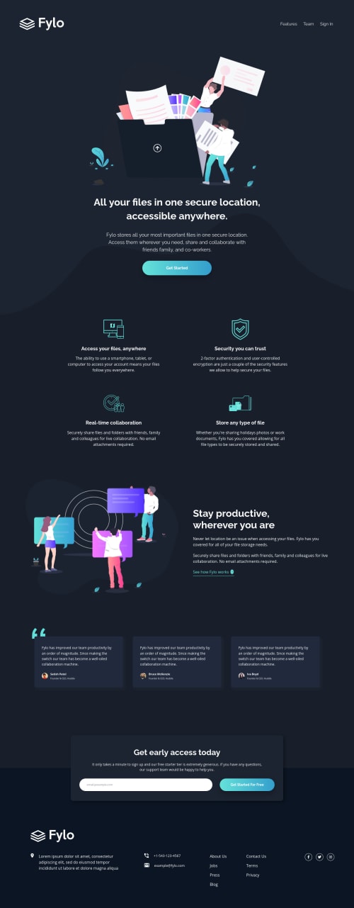
Fylo dark theme landing page | SASS | 7-1 Architecture | Mobile First

Kris Pietrzak•340
@krisp-dev
A solution to the Fylo dark theme landing page challenge
View live sitePreview (opens in new tab)View codeCode (opens in new tab)

Solution retrospective


Tried using the 7-1 SASS Architecture for this challenge and it definitely was something different that I had to wrap my head around.

Need to work on producing a more semantic HTML code as I had to "hack" the HTML by adding some classes and empty div's here and there when writing media queries from Mobile to Desktop.

Code
Couldn’t fetch repository

Please log in to post a comment

Log in with GitHub

Community feedback

  • P
    Dave•5,295
    @dwhenson
    Posted almost 4 years ago

    Hey @krisp-dev I just posted a long comment here, but it got lost when I tried to post it so I'm sorry if this is a bit short! Overall great job 🙌 here's some points to think about:

    1. You might want to think about stopping the page from spreading too wide a very large screens. There are many ways to do this but I set a grid on the body element, with three columns, as using a class selector as follows:
    .center-content {
    	display: grid;
    	grid-template-columns: minmax(1rem, 1fr) minmax(375px, 1440px)minmax(1rem, 1fr);
    }
    
    .center-content > *  {
    	grid-column: 2;
    }
    

    The 1440px is the max-width you want the main content to be, and the 1rem values is the smallest spacing you want either side of the main content on small screens (I sometimes put this to 0 and use a container to add padding to each section).

    The second part positions all direct children of the body in this nicely sized middle column. In my case, mostly, my header, main, and footer the middle column, and stops them going wider than 1440px. It’s also pretty easy to ‘break’ elements out of this constraint if you need to.

    Other people use container classes to do the same thing. Either way it's a good idea to find an approach that works for you as you'll need this for a lot of FEM challenges.

    1. On form validation, at the moment the in built validation runs on focus so I get an error before I even type anything. I think the inbuilt validation is a good fallback for some progressively enhanced validation using JS (if you are comfortable doing that...)

    For example, I would typically do the following:

    • On page load, add a listener to the form to i) prevent it being submitted by default, ii) add a 'novalidate' attribute to the form (as we are doing this with JS now, but if JS fails the inbuilt validation would still work), and then run a function to check the email validity.

    • Not sure how comfortable you are with JS, but then if the email validity fails, I then add another listener on the ‘change event to check the input every time someone types in the input, this then checks when the email is valid immediately and removes the error styles.

    Sorry if that sounds hectic, you can see an example in my code here:https://github.com/dwhenson/frontend-mentor/blob/master/28.%20fylo-landing-page/js/main.js

    Having just looked at this again, I would change the initial event listener to listen for the submit event, rather than click, and I would change the keydown event to change - as this will also validate if people paste a value in rather than type.

    Overall though lovely job!

    Cheers 👋

    Dave

    Marked as helpful

Join our Discord community

Join thousands of Frontend Mentor community members taking the challenges, sharing resources, helping each other, and chatting about all things front-end!

Join our Discord
Frontend Mentor logo

Stay up to datewith new challenges, featured solutions, selected articles, and our latest news

Frontend Mentor

  • Unlock Pro
  • Contact us
  • FAQs
  • Become a partner

Explore

  • Learning paths
  • Challenges
  • Solutions
  • Articles

Community

  • Discord
  • Guidelines

For companies

  • Hire developers
  • Train developers
© Frontend Mentor 2019 - 2025
  • Terms
  • Cookie Policy
  • Privacy Policy
  • License

Oops! 😬

You need to be logged in before you can do that.

Log in with GitHub

Oops! 😬

You need to be logged in before you can do that.

Log in with GitHub

How does the accessibility report work?

When a solution is submitted, we use axe-core to run an automated audit of your code.

This picks out common accessibility issues like not using semantic HTML and not having proper heading hierarchies, among others.

This automated audit is fairly surface level, so we encourage to you review the project and code in more detail with accessibility best practices in mind.

How does the CSS report work?

When a solution is submitted, we use stylelint to run an automated check on the CSS code.

We've added some of our own linting rules based on recommended best practices. These rules are prefixed with frontend-mentor/ which you'll see at the top of each issue in the report.

The report will audit 1st-party linked stylesheets, and styles within <style> tags.

How does the HTML validation report work?

When a solution is submitted, we use html-validate to run an automated check on the HTML code.

The report picks out common HTML issues such as not using headings within section elements and incorrect nesting of elements, among others.

Note that the report can pick up “invalid” attributes, which some frameworks automatically add to the HTML. These attributes are crucial for how the frameworks function, although they’re technically not valid HTML. As such, some projects can show up with many HTML validation errors, which are benign and are a necessary part of the framework.

Oops! 😬

You need to be logged in before you can do that.

Log in with GitHub