Not Found
Not Found
Not Found
Not Found
Not Found
Not Found
Not Found
Not Found
Not Found
Not Found
Not Found
Not Found
Not Found
Not Found
Not Found
Not Found
Not Found
Not Found
Not Found
Not Found

Submitted

Fylo Dark Theme Landing Page with HTML & CSS

Philip 320

@adedotxn

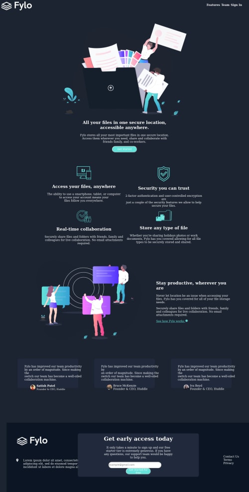
Desktop design screenshot for the Fylo dark theme landing page coding challenge

This is a solution for...

  • HTML
  • CSS
  • JS
2junior
View challenge

Design comparison


SolutionDesign

Solution retrospective


How do I resize the curvy background image, I had a lot of trouble with that and I still haven't gotten the hang of it

Community feedback

Roman Filenko 3,335

@rfilenko

Posted

Hey, good job here, but I see a lot of small issues. To debug some of them use rule - * {outline: 1px solid orange;}. This will help to fix overflow problem. A few points for future projects:

  • don't set defined heigth on containers;
  • preferable don't use id's for styling;
  • img { max-width: 100%;} will make all images responsive;
  • it's better to set max-width on wrapping containers instead of just width.
  • use flexbox or css gris for layout, don't use position;
  • for spacing inside use padding.

Try to fix some issues first, good luck😉

Cheers, Roman

2

Philip 320

@adedotxn

Posted

@rfilenko Thanks a lot, I'll get to fixing it right now :)

0
P
ApplePieGiraffe 30,545

@ApplePieGiraffe

Posted

Hey, Phyf3! 👋

Good effort on this challenge! 👍

To clear up some of the errors on your solution report, try to get rid of the duplicate ID's (and use classes for styling, as rfilenko suggested) and make sure to identify all of the <section> tags you use with a heading. Speaking of headings, I suggest going with what the solution report recommends and using a single <h1> tag for the page and less important heading tags for the rest of the headings.

Keep coding (and happy coding, too)! 😁

1

Philip 320

@adedotxn

Posted

@ApplePieGiraffe thank youu, I'll do just that

0
Philip 320

@adedotxn

Posted

also i don't get why the design/solution comparison is displaying this way, looks better when you preview the site ;)

0

Please log in to post a comment

Log in with GitHub
Discord logo

Join our Discord community

Join thousands of Frontend Mentor community members taking the challenges, sharing resources, helping each other, and chatting about all things front-end!

Join our Discord