Fylo data storage component

Solution retrospective
Hey guys,
This was a really fun little project. Without proper data behind it, it seem like a useless component so I just focused on having fun with it.
I added a tiny animation for the data bubble so the whole thing doesn't look so static.
I also tried declaring my custom properties differently this time following Kevin Powell's video so I can manipulate colours more easily. This is definitely something I add to future projects as well!
I used fixed widths for this component. I usually go with max-width, clamp, minmax, etc for setting the width but I thought for this challenge having a fixed width just makes more sense. I tried to pay attention to having the right breakpoints, so it's still responsive, hopefully :)
For the functions (like upload, etc) I used buttons but there may be a better solution. My logic was that these icons would add some functionality instead of pointing to different websites, so button seemed the most appropriate.
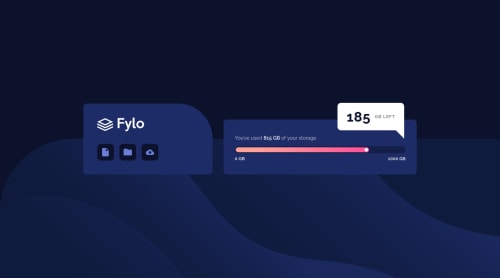
Since the display bar of that data usage isn't functional, I just had fun with CSS and made it purely decorative. ^^
If there was any way to improve on this, I'd love to hear it!
Have a good evening everyone!
Please log in to post a comment
Log in with GitHubCommunity feedback
- @RyukioMiyamoto
This is stellar work! I've got nothing to say regarding the styling since you clearly got that covered, but I do have a suggestion regarding accessibility, as some people get motion sickness from animations, and someone once pointed out to me the prefers-reduced-motion query, which I find very important and always try to implement ever since (sorry if you're already aware of it).
Marked as helpful

Join our Discord community
Join thousands of Frontend Mentor community members taking the challenges, sharing resources, helping each other, and chatting about all things front-end!
Join our Discord