Not Found
Not Found
Not Found
Not Found
Not Found
Not Found
Not Found
Not Found
Not Found
Not Found
Not Found
Not Found
Not Found
Not Found
Not Found
Not Found
Not Found
Not Found
Not Found
Not Found

Submitted

Fylo data storage component challenge
@CSumm

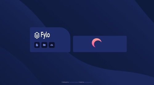
Desktop design screenshot for the Fylo data storage component coding challenge

This is a solution for...

  • HTML
  • CSS
2junior
View challenge

Design comparison


SolutionDesign

Solution retrospective


Any guidance, feedback, criticisms or suggestions are welcomed!

Community feedback

P
ApplePieGiraffe 30,565

@ApplePieGiraffe

Posted

Hey, Carl Summers!

I think you can wait until the width of the viewport is less than 1440px to break into a mobile-friendly layout—the desktop layout might still look good for a couple of hundred pixels or so. Also, when the page first switches to a mobile layout, the white dot at end of the storage space bar... isn't quite at the end (until the width of the viewport gets much smaller).

Otherwise, nice work!

Keep coding (and happy coding, too)!

😄

1

@CSumm

Posted

Hi thanks for the feedback! I agree with the desktop layout can be shown on screen sizes a bit smaller than 1440px, I'll definitely make changes to that.

Also, I see what you mean about the dot not being at the end. I assumed that because it would only be viewed on mobile and screens 1440px and larger, I wouldn't need to take that into consideration (which is bad and I shouldn't assume).

I'll make the changes you suggested. Thanks again ApplePieGiraffe!

0
P
ApplePieGiraffe 30,565

@ApplePieGiraffe

Posted

@CSumm

NP!

Glad to know the feedback helped!

0

Please log in to post a comment

Log in with GitHub
Discord logo

Join our Discord community

Join thousands of Frontend Mentor community members taking the challenges, sharing resources, helping each other, and chatting about all things front-end!

Join our Discord