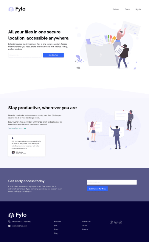
Fylo Landing Page | Mobile First | HTML & CSS

Solution retrospective
While I'm happy with the result that you see on screen, I'm unhappy with the underlying "code". I think there could have been a much simpler and cleaner way to achieve the same result. I feel that my solution is too "hacky", relying too much on margins and padding to achieve a perfect match against the original.
The main thing I learned/realized during the process is that I need to do much more forward-planning (now that these challenges are becoming larger and more complex). I think I also need to see the Figma design, so that I can work out the dimensions in advance and (hopefully) inform my approach to the solution.
I'd love to hear from anyone on their experiences of having access to the Figma design files!
I'm feeling more confident using semantic markup, but it's such a big subject and tips and pointers would be most welcome! :)
Thanks for taking a look. Have a great day!
Please log in to post a comment
Log in with GitHubCommunity feedback
No feedback yet. Be the first to give feedback on Michael Waaler's solution.
Join our Discord community
Join thousands of Frontend Mentor community members taking the challenges, sharing resources, helping each other, and chatting about all things front-end!
Join our Discord