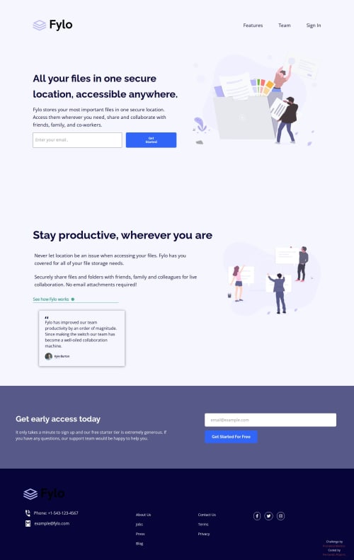
Fylo landing page with two column layout

Solution retrospective
I’m most proud of successfully implementing a clean, responsive two-column layout that adapts perfectly from mobile to desktop using Flexbox. The testimonial section was a nice challenge and I managed to create a visually balanced design that matches the original.
Next time, I would spend more time refining the interactive states (hover, focus) from the start, to ensure consistent UI feedback across all buttons and links. I’d also try to optimize the CSS by reducing repetition and maybe explore CSS Grid for even more control.
What challenges did you encounter, and how did you overcome them?One of the main challenges was managing the layout switching between mobile and desktop views while keeping the code simple and maintainable. I had to carefully structure my media queries and choose Flexbox properties that worked well in both directions.
Additionally, adding smooth and visually appealing hover and active states to buttons and social media links took some experimentation with color opacity and transitions. I tested different color values until I found the right balance between visibility and subtlety.
What specific areas of your project would you like help with?I would appreciate feedback on how to improve the accessibility of the form elements and buttons, especially regarding keyboard navigation and screen reader friendliness.
Also, if there are suggestions on optimizing the CSS structure for scalability or alternative layout techniques (like CSS Grid) that could make the code cleaner, I’d be interested in learning more.
Please log in to post a comment
Log in with GitHubCommunity feedback
No feedback yet. Be the first to give feedback on Fernando Luis Pizarro's solution.
Join our Discord community
Join thousands of Frontend Mentor community members taking the challenges, sharing resources, helping each other, and chatting about all things front-end!
Join our Discord