Not Found
Not Found
Not Found
Not Found
Not Found
Not Found
Not Found
Not Found
Not Found
Not Found
Not Found
Not Found
Not Found
Not Found
Not Found
Not Found
Not Found
Not Found
Not Found
Not Found

Submitted

fylo-dark-theme-landing-page-master
Mojtaba Mosavi• 3,760

@MojtabaMosavi

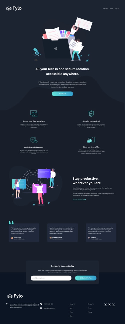
Desktop design screenshot for the Fylo dark theme landing page coding challenge

This is a solution for...

  • HTML
  • CSS
  • JS
2junior
View challenge

Design comparison


SolutionDesign

Solution retrospective


This one toke a bit more time than I expected but this happens always. I would really appreciate it if you share your toughts about any of the following qestion.

  1. I dicided to exclude the hero section from the main, is doing so in any inappropriate or bad practice ?

  2. Should all the typografi for components be written in the same file as for the rest of the page ?

  3. In the testimonials section, the first testimonial has quoate icon on top of it the needs to be partially underneth the testimonial, I tried with z-index but for some mystrious reason it didn't work, how can it be fixed ?

  4. What tool do you use for measuring font-size in you projects ?

  5. You guys who always get the measurment aspect of the design right, I would appreciate if you share some of your tips/tricks.

Happy coding :)

Community feedback

Karim• 590

@Galielo-App

Posted

hello!

Sure, here are my opinions:

  • The best semantically speaking Html structure IMO is this:
  <header></header>
  <main>
    <section></section>
    //all of your sections should go inside a <section> nested inside main
    <section></section>
  </main>
  <footer></footer>
  • No, they don't. I prefer to keep them in another file so it is easier to maintain.
  • For me is actually working fine, but I would suggest using ::before with position: absolute (make sure the parent element is position: relative).
  • I usually use Figma or sketch.
  • If you're not a pro member, you will still have the jpeg of each page of the project. So open Figma, drop them inside your workspace, and create blocks to measure height and width.

Please upvote my comment and happy coding :)

3

Mojtaba Mosavi• 3,760

@MojtabaMosavi

Posted

@Galielo-App thanks. About the positioning, that's exactly what I've done but for some strange reason it doesn't work.

0
Karim• 590

@Galielo-App

Posted

@MojtabaMosavi very weird!

for me, your website is working fine

0
Wisdom Ojimah• 170

@detachedsoul

Posted

What I would have done is instead of making the quotes a background image, you put it in the first testimony card and make that card positioned relatively. Then you can make the quote absolute and manipulate it as you like.

Something like:

<div //this would be position: relative >
     <img src="your quotes>
    // testimonial content
</div>

You can now use z-index the quotes and move it around.

1

Mojtaba Mosavi• 3,760

@MojtabaMosavi

Posted

@detachedsoul thanks.

0

Please log in to post a comment

Log in with GitHub
Discord logo

Join our Discord community

Join thousands of Frontend Mentor community members taking the challenges, sharing resources, helping each other, and chatting about all things front-end!

Join our Discord