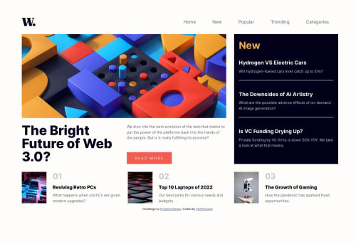
Great fun with Grid+Flex, CSS-only menus, :has(), .clamp(), no JS

Solution retrospective
I found many great puzzles to solve in this layout. I chose to build the mobile menu with pure CSS, no JS, and I learned quite a bit working out all the details:
-- how to apply a background overlay to the <body> on menu open (and remove the overlay not only on menu-close, but also if the screen is resized past the breakpoint with the mobile menu still open). -- how to change mobile menu icons on open/close. -- how to best divide the desktop layout for Grid/Flex layout. -- How many breakpoints do I need (I ended up doing it with just one, after much experimentation). -- How to best compact the bottom posts on desktop (I went with -webkit-line-clamp)
I avoid looking at other solutions until I finish my own version of the project, but I now intend to check out how others have done this one. Any feedback is very appreciated.
Please log in to post a comment
Log in with GitHubCommunity feedback
No feedback yet. Be the first to give feedback on Ted Rinquest's solution.
Join our Discord community
Join thousands of Frontend Mentor community members taking the challenges, sharing resources, helping each other, and chatting about all things front-end!
Join our Discord