Grid, Flex, mobile-first

Solution retrospective
Just wanna keep getting better at it even if slowly.
Please log in to post a comment
Log in with GitHubCommunity feedback
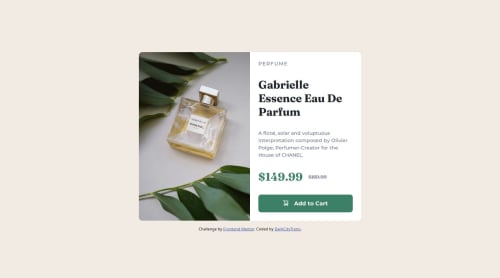
- @Yahia-kilany
The code is nice, using CSS variables and responsive design effectively imo. However, you should consider using the
letter-spacingproperty on "perfume" to achieve the same effect as in the original design. it should be something like this.product-type{ letter-spacing: 3px; }other than that I don't think I can give any other advice.
Marked as helpful - @Ojay16
Hi there!
Congrats on completing the challenge! ✅
Your project looks amazing!
I'd like to suggest a fix for a little problem u have :
U could try using the CSS
letter-spacing:;property to add spacing between the letters of the "Perfume" paragraph to give the required outcome.Here's a highly efficient approach:
📌 Apply this CSS to your paragraph with the
.product-typeclass:.product-type{ letter-spacing: 5px; }The
letter-spacing: 5px;property gives 5px of spacing between each letter, Thus giving you the desired outcome.Hope you find this helpful
Happy coding!
Marked as helpful


Join our Discord community
Join thousands of Frontend Mentor community members taking the challenges, sharing resources, helping each other, and chatting about all things front-end!
Join our Discord