Grid Flexbox html Css Scss

Solution retrospective
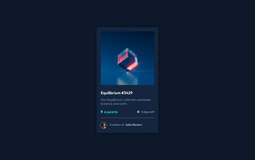
*What are you most proud of, and what would you do differently next time? I'm most proud of how clean and polished the final component looks, especially the hover interaction that reveals the eye icon overlay. It was rewarding to see a simple concept come to life with just HTML and CSS, while still feeling interactive and modern.
I also took extra care to ensure consistent spacing, alignment, and color contrast, which really helped the design feel cohesive and accessible. Getting the transitions smooth and subtle was another highlight, as it enhanced the user experience without being distracting.
*If I were to do it again, I’d structure the project with CSS custom properties (variables) to make theming easier and more maintainable. I’d also consider implementing the layout with flexible units (like rem or em) and a utility-first approach like Tailwind CSS to scale faster and avoid repetitive styles.
Finally, adding keyboard accessibility to make the card fully interactive without a mouse (using :focus-visible and ARIA roles) would be my next goal for improvement.*
What specific areas of your project would you like help with?I would like advice on how to improve css
Please log in to post a comment
Log in with GitHubCommunity feedback
- @gustavo2023
Looks great, keep it up!

Join our Discord community
Join thousands of Frontend Mentor community members taking the challenges, sharing resources, helping each other, and chatting about all things front-end!
Join our Discord