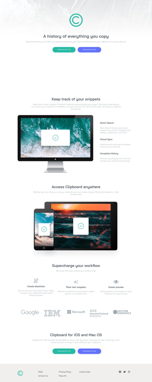
grid layout landing page

Solution retrospective
Any comment or recommendation would be appreciate it.
Please log in to post a comment
Log in with GitHubCommunity feedback
- @brasspetals
Hello again, Saman! Congrats on submitting another solution. 😄
You did yet another good job on this challenge, but I do have a few suggestions:
-
On large screens (ex: 1920px), the header background image doesn’t fill the screen. Adding
background-size: containwill fix this. -
On the desktop version, there is too much space between the
headerandmain. I suggest removing theheight: 100vhfrom the header and using margins instead. -
Increasing the font-size of your buttons. Here they are also technically not buttons, but “button” styled links, so I also suggest changing them to
atags to be more semantically correct. -
Adding a
max-widthto your.maind-imgsince they get very large between 450px-800px.
As always, happy coding!
-
- @saman-zdf
Hello to you too brasspetals, thanks for taking your time and pointing out my mistakes, I'm really appreciate it, I'll fix them. is header should get margin from top you meant? Thanks.
Join our Discord community
Join thousands of Frontend Mentor community members taking the challenges, sharing resources, helping each other, and chatting about all things front-end!
Join our Discord