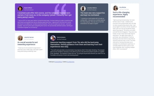
Not Found
Not Found
Not Found
Not Found
Not Found
Not Found
Not Found
Not Found
Not Found
Not Found
Not Found
Not Found
Not Found
Not Found
Not Found
Not Found
Not Found
Not Found
Not Found
Not Found

Submitted

Grid Positioning

Victor Okekeโ€ข 170

@okekevicktur

Desktop design screenshot for the Testimonials grid section coding challenge

This is a solution for...

  • HTML
  • CSS
2junior
View challenge

Design comparison


SolutionDesign

Solution retrospective


I learnt grid. Wasn't easy at first but I finally got used to it. Now, I am a lover

Community feedback

Lucas ๐Ÿ‘พโ€ข 104,580

@correlucas

Posted

๐Ÿ‘พHello Victor Okeke, congratulations for your new solution!

Here's some tips for you to improve your solution:

First of all the container size is a bit smaller, changing this width you avoid it growing too much:

}
.container {
    max-width: 1110px;
}

The html structure youโ€™ve used here works, but if you want to make this even better, you can replace the <div> youโ€™ve used to keep the blocks and replace with some better html markup and semantic, for example, the main block can be wrapped with <main> and each testimonial card with <article>, then you can use a tag that not everyone knows, for the paragraph containing the quote you can replace the <p> with <blockquote> that is tag the describe exactly its content.

Here's a complete guide for HTML semantic TAGS: https://www.w3schools.com/TAgs/default.asp

To make this alignment, first of all put min-height: 100vh to the body to make the body display 100% of the viewport height (this makes the container align to the height size thats now 100% of the screen height) size and display: flex e flex-direction: column to align the child element (the container) vertically using the body as reference.

body {
    min-height: 100vh;
    font-size: 13px;
    font-family: 'Barlow Semi Condensed', sans-serif;
    background: hsl(210, 46%, 95%);
    display: flex;
    align-items: center;
    justify-content: center;
}

โœŒ๏ธ I hope this helps you and happy coding!

Marked as helpful

0
AntoineCโ€ข 1,180

@AntoineC-dev

Posted

Hello Victor Okeke. Good job on completing the challenge. This is a good work. It looks really close to the design which is great!

I have some small suggestions for you:

  • You might want to make sure the the content is always centered on the screen by adding some properties to the body element:
body{
    font-size: 13px;
    font-family: 'Barlow Semi Condensed', sans-serif;
    background: hsl(210, 46%, 95%);

    display: flex;
    min-height: 100vh;
    justify-content: center;
    align-items: center;
}
  • I see that you used min-width for your container on desktop but instead i would use this:
.container{
      min-width:1200px; -- Remove this

      max-width: 92rem;
      width: 100%;
}

You could also use the CSS function width: min(100%, 92rem) which gives the save result.

1rem = 16px feel free to experiment with it to keep it close to the design. Because right now it looks really stretched on large screens.

Again good job with the solution and happy coding ๐Ÿ˜€

Marked as helpful

0

Victor Okekeโ€ข 170

@okekevicktur

Posted

@AntoineC-dev Thanks

0

Please log in to post a comment

Log in with GitHub
Discord logo

Join our Discord community

Join thousands of Frontend Mentor community members taking the challenges, sharing resources, helping each other, and chatting about all things front-end!

Join our Discord