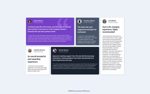
Submitted over 3 years agoA solution to the Testimonials grid section challenge
Grid section responsive with sass and BEM

@Lenugo
Code
Please log in to post a comment
Log in with GitHubCommunity feedback
- @grace-snow
Hell
This looks good overall but there are some improvements to suggest
- heading levels should be increased. They should only be h3 if there is a h2 above them in each article
- verified graduate is not a heading. Try paragraph with small tag
- maybe consider using figure, figcaption and blockquote elements for this. That’s a recommended approach for testimonials
- important: Never put font sizes in px, use rem (or em sometimes)
- consider converting all pixel units to REM. Then if users have different zoom/base font settings all will scale together
- Don’t forget small design details like the box shadow on white bg boxes
- There is loads of repetition in the css. See if you can create some more reusable classes for all the shared styles. All the individual boxes need is a color class and a grid area (grid area can also be done with nth of type / nth child, but having unique classes is ok for grid placement if you prefer)
Good luck

Join our Discord community
Join thousands of Frontend Mentor community members taking the challenges, sharing resources, helping each other, and chatting about all things front-end!
Join our Discord