Solution retrospective
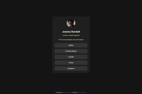
It was a pretty basic challenge, with a focus on the hover state.
What specific areas of your project would you like help with?I didn't find it difficult, but feedback are alway appreciated :)
Please log in to post a comment
Log in with GitHubCommunity feedback
- @thisisharsh7
Great job on completing the challenge!
What you did well:
- Strong use of CSS variables for colors and fonts — it adds flexibility and makes your theme easy to manage.
- Using
display: gridinbodyfor vertical centering is a smart choice and keeps the layout simple. - The
:rootdeclaration is neat and logically grouped. - Love the hover effect on social links — smooth and accessible.
Some suggestoin:
- Since you're already using
max-widthin.profile-card, there's no need for the additionalmargin-top(margin: 11.5rem auto;) if vertical centering via grid is already in place. - Consider setting
line-heightonbodyor text elements for better readability. - You could add
:focusstyles to links for better accessibility (keyboard navigation).
Overall, great attention to detail — happy coding!
Marked as helpful
Join our Discord community
Join thousands of Frontend Mentor community members taking the challenges, sharing resources, helping each other, and chatting about all things front-end!
Join our Discord