Submitted over 1 year agoA solution to the Product preview card component challenge
HTML and CSS
web-components

@AllRedCat
Solution retrospective
What did I can impruve in my CSS skills
Code
Please log in to post a comment
Log in with GitHubCommunity feedback
- @pbryan9
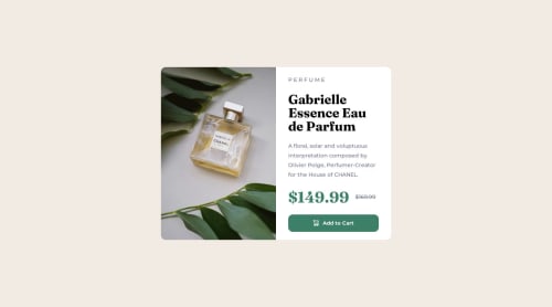
Just about perfect on desktop! The only improvement I can spot there is to do with font sizing and padding -- your elements are crowding the edge of the card just a little bit on desktop.
Mobile looks good at the ideal 375px size, but it should probably keep the column layout for another couple hundred pixels -- the larger layout doesn't quite fit until the viewport gets a little over 600px.
Nice job!!
Marked as helpful - @susmitha168
Design solution looks good Here are my observations:
- Price font size is larger when compared to the design
- Button design looks little different except that rest are good.


Join our Discord community
Join thousands of Frontend Mentor community members taking the challenges, sharing resources, helping each other, and chatting about all things front-end!
Join our Discord