
Solution retrospective
I'm most proud of successfully implementing a responsive design that looks great on both mobile and desktop devices 📱💻. However, next time, I would spend more time planning the layout to avoid any last-minute adjustments and ensure a smoother development process 🚀.
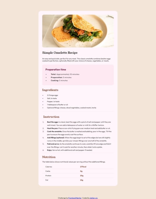
What challenges did you encounter, and how did you overcome them?One of the main challenges was handling the image display for mobile devices. Initially, I had to place the first image in the body and then use CSS to set it to display: none for desktop and display: block for mobile 📱. I overcame this by leveraging media queries to conditionally show and hide images, ensuring a seamless and responsive design experience 🎨.
I would appreciate help with optimizing the layout for different screen sizes to ensure a more consistent look across devices. Additionally, advice on improving the overall code structure and efficiency would be highly valuable. Any tips on enhancing the user experience and accessibility would also be greatly appreciated. 😊
Please log in to post a comment
Log in with GitHubCommunity feedback
No feedback yet. Be the first to give feedback on zlatan-cic's solution.
Join our Discord community
Join thousands of Frontend Mentor community members taking the challenges, sharing resources, helping each other, and chatting about all things front-end!
Join our Discord