Skip to content
  • Unlock Pro
  • Log in with GitHub
Solution
Submitted about 3 years ago

html and css

jake•140
@jakewebd
A solution to the 3-column preview card component challenge
View live sitePreview (opens in new tab)View codeCode (opens in new tab)

Solution retrospective


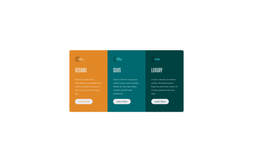
constructive criticism is appreciated! let me know best practices that i maybe should have used and if i did the media queries right (first time using them). also if you change the <h2> in section 1 to <h1> or the others to different <h> tags then it throws off the whole section a little in terms of sizing relative to the other sections. i dont know why this happens as i styled it with the class "headers" so isnt it supposed to override it and the <h1> shouldnt matter whatever number it is? (you can try yourself in chrome devtools to see what i mean)

Thanks!

Code
Select a file

Please log in to post a comment

Log in with GitHub

Community feedback

  • Karishma Garg•1,010
    @karishma-dev
    Posted about 3 years ago

    Hi, Your solution looks good.

    Few suggestions:

    1. To properly center the card you can use something like this: body{ display: flex; justify-content: center; align-items: center; min-height: 100vh; In this, justify-content will align the content to the center of the main axis and align-items will align the content to the center of the cross-axis (perpendicular to the main axis).
    2. For the problem you are facing in the headers class, you can see that in dev tools it is showing that all the heading tags have their own margins that's why your layout gets disturbed as you haven't overridden the margin in .headers class.
    3. In the CSS code, you can remove the max-width media query and write its content before the min-width query, and then just make the necessary changes that you want for the desktop version. For example: I can see that you have written margin-left and right auto for .main-container in both the queries, so if you want this class to have these margin for the whole layout then write it without media queries.

    Hope this helps you! Good luck!

    Marked as helpful
  • Marko Đurić•60
    @MarkoDjuric
    Posted about 3 years ago

    Check out how to use rem units instead of px units. You should start out using CSS grid - less code than with flexbox. For example this layout you can set like this:

    1. display:grid;
      place-items: center; -- on "main-container"

    2. @media screen and (min-width: 376px){ grit-template-columns: 1fr 1fr 1fr; } So, in this way you have 3 equal columns without flexbox percentage with more precision.

    Marked as helpful

Join our Discord community

Join thousands of Frontend Mentor community members taking the challenges, sharing resources, helping each other, and chatting about all things front-end!

Join our Discord
Frontend Mentor logo

Stay up to datewith new challenges, featured solutions, selected articles, and our latest news

Frontend Mentor

  • Unlock Pro
  • Contact us
  • FAQs
  • Become a partner

Explore

  • Learning paths
  • Challenges
  • Solutions
  • Articles

Community

  • Discord
  • Guidelines

For companies

  • Hire developers
  • Train developers
© Frontend Mentor 2019 - 2025
  • Terms
  • Cookie Policy
  • Privacy Policy
  • License

Oops! 😬

You need to be logged in before you can do that.

Log in with GitHub

Oops! 😬

You need to be logged in before you can do that.

Log in with GitHub

How does the accessibility report work?

When a solution is submitted, we use axe-core to run an automated audit of your code.

This picks out common accessibility issues like not using semantic HTML and not having proper heading hierarchies, among others.

This automated audit is fairly surface level, so we encourage to you review the project and code in more detail with accessibility best practices in mind.

How does the CSS report work?

When a solution is submitted, we use stylelint to run an automated check on the CSS code.

We've added some of our own linting rules based on recommended best practices. These rules are prefixed with frontend-mentor/ which you'll see at the top of each issue in the report.

The report will audit all CSS, SCSS and Less files in your repository.

How does the HTML validation report work?

When a solution is submitted, we use html-validate to run an automated check on the HTML code.

The report picks out common HTML issues such as not using headings within section elements and incorrect nesting of elements, among others.

Note that the report can pick up “invalid” attributes, which some frameworks automatically add to the HTML. These attributes are crucial for how the frameworks function, although they’re technically not valid HTML. As such, some projects can show up with many HTML validation errors, which are benign and are a necessary part of the framework.

How does the JavaScript validation report work?

When a solution is submitted, we use eslint to run an automated check on the JavaScript code.

The report picks out common JavaScript issues such as not using semicolons and using var instead of let or const, among others.

The report will audit all JS and JSX files in your repository. We currently do not support Typescript or other frontend frameworks.

Oops! 😬

You need to be logged in before you can do that.

Log in with GitHub

Oops! 😬

You need to be logged in before you can do that.

Log in with GitHub