


@PhoenixDev22
Posted
Hello @Bazthos ,
I have some suggestions regarding your solution:
-
First of all , tables were never intended to be used for page layouts as it is Slow to render as the browser needs to download most - if not all - of the table to render it properly. for future , Use a table for tabular data and read more about the tables structures.
-
Use the main landmark to wrap the body content . HTML5 landmark elements are used to improve navigation .
-
Anything with a hover style in design means it's interactive. you need to add an interactive element
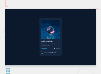
<a>around the image ,Equilibrium #3429 and Jules Wyvern. -
For any decorative images, each img tag should have empty
alt=""andaria-hidden="true"attributes to make all web assistive technologies such as screen reader ignore those images in (icon-view, icon-ethereum, icon-clock) -
the
icon-viewsvg doesn't really need to be in the html, you could do it with css. If you want it to stay in html it needs to be aria-hidden or role presentation with empty alt. -
In the avatar's alt shouldn't be avatar image , it's meaningless . you can use
Jules Wyvern. -
the link should be wrapping the main image and either have
Sr-onlytext, anaria-labeloralttext that says where that link takes you. -
There are so many ways to add the hover effect on the image , The one I would use pseudo-elements to change the teal bg color to a hsla. Then opacity can be changed from 0 to 1 on the pseudo element on hover as there is no reason to have the extra clutter
. overlayin the html. -
You can use
<ul>to wrap theid="contain", and in each <li> there would be<img >and<p>. then use the flexbox properties to aligh them centrally. -
you can use
<p>instead of<h2>, as they are not headers. -
For the avtart's part , you may use
<figure >and<figcaption>. -
After you refactor you HTML, to center the card on the middle of the page , you can use the flexbox properties and
min-height: 100vhfor the<body>. -
using
min-height: 100vhinstead ofheight: 100vhallows the body to to grow taller if the content outgrows the visible page. -
width: 300px;an explicit width is not a good way . consider usingmax-widthto card instead. That will let it shrink a little when it needs to. -
height: 500px;It's rarely ever a good practice to set heights on elements . Let the content inside the card element dictate the height of it. -
You should use
emandremunits .Bothemandremare flexible, Usingpxwon't allow the user to control the font size based on their needs. General point : Really important to keep css specificity as low/flat as possible. The best way to do styling is single class selectors.
Overall , your solution is good. Hopefuly this feedback helps.
Marked as helpful
@Bazthos
Posted
Hello @PhoenixDev22,
Thank a lot for this detailed explanation, this will allow me to develop the right habits from the start. I'll follow the links and watch how you approached the problem so I can learn more about my mistakes.
I wish you all the best in your future endeavors.


