
Solution retrospective
I tried to use classes for manipulating CSS rather than using inline CSS.
What challenges did you encounter, and how did you overcome them?Locating the items to the center is hard thing to do. I used display block command and adding margin:0 auto command rather than display flex.
What specific areas of your project would you like help with?It would be great if you check my coding logic, responsiveness, and give feedback which parts I can improve.
Please log in to post a comment
Log in with GitHubCommunity feedback
- P@Stroudy
Awesome job tackling this challenge! You’re doing amazing, and I wanted to share a couple of suggestions that might help refine your approach…
-
Developers should avoid using pixels (
px) because they are a fixed size and don't scale well on different devices. Instead, useremorem, which are relative units that adjust based on user settings, making your design more flexible, responsive, and accessible. For more information check out this, Why font-size must NEVER be in pixels or this video by Kevin Powell CSS em and rem explained.- Another great resource for px to rem converter. -
Using
max-width: 100%ormin-width: 100%is more responsive than justwidth: 100%because they allow elements to adjust better to different screen sizes. To learn more, check out this article: responsive-meaning. -
Using a
<main>tag inside the<body>of your HTML is a best practice because it clearly identifies the main content of your page. This helps with accessibility and improves how search engines understand your content. -
I would put these into a
<ul> <li>, and the text should be wrapped with a<a>so it is accessible with a keyboard using the tab key, Using an<a>tag for navigation is semantically correct, improves accessibility for screen readers, and ensures consistent behavior across browsers, unlike a<button>or a<div>not intended for links.
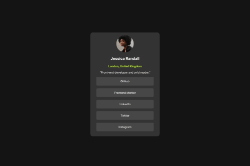
      <p class="Social_inside">GitHub</p>
      <p class="Social_inside">Frontend Mentor</p>
      <p class="Social_inside">LinkedIn</p>
      <p class="Social_inside">Twitter</p>
      <p class="Social_inside">Instagram</p>
You’re doing fantastic! I hope these tips help you as you continue your coding journey. Stay curious and keep experimenting—every challenge is an opportunity to learn. Have fun, and keep coding with confidence! 🌟
Marked as helpful -
- P@MikDra1
If you want to make your card responsive with ease you can use this technique:
.card {
width: 90%;
max-width: 37.5rem;
}
On the smaller screens card will be 90% of the parent (here body), but as soon as the card will be 37.5rem (600px) it will lock with this size.
Also to put the card in the center I advise you to use this code snippet:
.container {
display: grid;
place-items: center;
}
Hope you found this comment helpful 💗💗💗
Good job and keep going 😁😊😉
- @Extendo99
The container has a different color than the one given in the project. There are also differences in the spacing between elements, especially the name and address. The font size also varies.
In CSS, you use enter for each attribute and there is a space. I recommend removing this to make the code more readable. It's better to use an external CSS file as well. Currently, the HTML file is difficult to read due to these CSS styles and it is difficult to make changes to it.
It is better to set the font size using REM
The code is not adapted to the different resolutions of mobile, tablet and desktop.


Join our Discord community
Join thousands of Frontend Mentor community members taking the challenges, sharing resources, helping each other, and chatting about all things front-end!
Join our Discord