Not Found
Not Found
Not Found
Not Found
Not Found
Not Found
Not Found
Not Found
Not Found
Not Found
Not Found
Not Found
Not Found
Not Found
Not Found
Not Found
Not Found
Not Found
Not Found
Not Found

Submitted

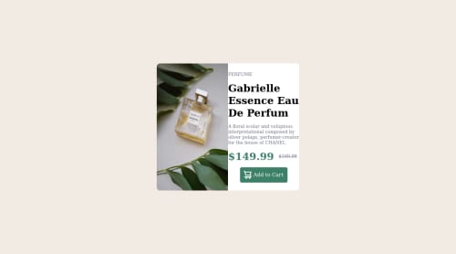
html & css , preview a perfume product with a discount.

#bootstrap

@kareemIsWebDevelper

Desktop design screenshot for the Product preview card component coding challenge

This is a solution for...

  • HTML
  • CSS
1newbie
View challenge

Design comparison


SolutionDesign

Solution retrospective


Hi, when designing i have found a difficulty making website fit for and desktop at the same time and i git into stack. if someone can help me, i will appreciated.

Community feedback

@YariMorcus

Posted

Hi Kareem,

Even though you had it difficult to make the website fit on both mobile and desktop, I must say that it still looks pretty good.

The best way to solve this problem is by following the 'mobile first' principle. In short: you create your design for mobile first, then tablet, and then desktop. With this approach, you use the min-width media feature rule within @media (@media (min-width: 768px) e.g.).

Another tip I have for you is to define your layout structure first, and when everything works correctly, you add the visual parts to your box (background color etc.). What I always do is adding a border around all my boxes, make sure the layout is correct, and then remove the border (which was temporarily used to identify the boxes).

Other tips

  1. Try to use a little more of the semantic HTML elements HTML5 offers you for structuring your document. You can think of <article>, <section> and <header>. When you start using these semantic HTML elements more, you make your component even more accessible for people who use assistive technologies (such as screen readers), because theses HTML elements are recognized better than using the common 'div' or 'span' for example.
  2. For your 'Add to Cart' button: use the <button> element. One of the reasons for this can be found above this point, but the other one is because you cannot place focus on the button (which can be done with keyboard navigation (tab key)).
  3. Try to bring a little order in your stylesheet. Your element, class, and id selectors are all mixed up. A common practice is to place the generic styling (element) selectors at the top of your stylesheet, the more specific (class) selectors underneath it, and then the id selectors. Another way to organize your CSS is to bring order to your CSS declarations. A handy website I use as a reference is codeguide.co.

I hope you can do something with the tips I gave you. Don't see it as something you need to do, but rather something for later (you are always free to correct your solution).

If I made a mistake somewhere in this post, feel free to correct me and keep building awesome things :D.

Marked as helpful

0

@kareemIsWebDevelper

Posted

@YariMorcus Thank you yari, it's so helpful.

1

Please log in to post a comment

Log in with GitHub
Discord logo

Join our Discord community

Join thousands of Frontend Mentor community members taking the challenges, sharing resources, helping each other, and chatting about all things front-end!

Join our Discord