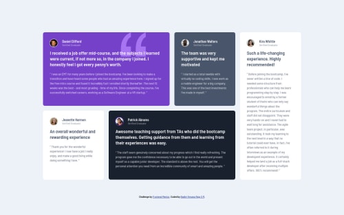
Submitted almost 4 years agoA solution to the Testimonials grid section challenge
HTML and CSS

@Badhrikr
Solution retrospective
Any suggestions are very much welcomed.
Code
Please log in to post a comment
Log in with GitHubCommunity feedback
- Account deleted
Hey!
Some quick fixes:
- don't use height: 100vh on the <body> but min-height:100vh. I did the same mistake on a challenge but it won't break your design :)
- don't use # to style your components (ex:id="dark"), use .dark because you can't have the same ID in your DOM. (Look the HTML issues in your report)
- I would give your Grid Container more control to have a more fluid layout (no fixed width but max-width:1080px; grid-template-rows: auto; to avoid break rows) and I would play with margin-left/right when necessary (mobile for example).
Hope it helps :)
Marked as helpful - @Dharmik48
Hey👋,
Great job with the solution! Looks really good, but.. I have a couple of suggestions:
- First, I think you should change the value in media query to
900pxinstead of768pxas around850pxscreen width, there seems to be an horizontal scrollbar. - And a minor thing, in your solution there is lot of empty white space at the bottom of the cards.
Apart from these, it is really good, Keep it up👍
Marked as helpful - First, I think you should change the value in media query to

Join our Discord community
Join thousands of Frontend Mentor community members taking the challenges, sharing resources, helping each other, and chatting about all things front-end!
Join our Discord