Not Found
Not Found
Not Found
Not Found
Not Found
Not Found
Not Found
Not Found
Not Found
Not Found
Not Found
Not Found
Not Found
Not Found
Not Found
Not Found
Not Found
Not Found
Not Found
Not Found

Submitted

html and Sass using Scss

@ahmedalhalfa

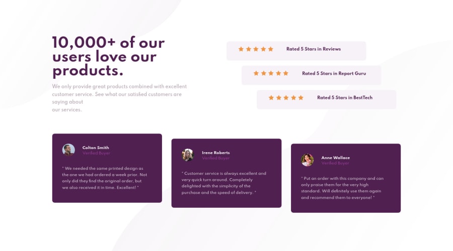
Desktop design screenshot for the Social proof section coding challenge

This is a solution for...

  • HTML
  • CSS
1newbie
View challenge

Design comparison


SolutionDesign

Solution retrospective


what about code readability ? on a 1-10 scale, how does my design replicate the original one ? what can be further improved ? thanks in advance!

Community feedback

Jane 1,040

@janegca

Posted

Hi Ahmed, as Grace noted, the design is not responsive. You may want to check out Kevin Powell's Responsive Design Made Easy video on YouTube. I believe he always has a walk-through of this particular design if you are really stuck.

Hope that's of some help.

1

@ahmedalhalfa

Posted

@janegca thanks for the comment and the help :), i only made it responsive with the media queries for phones with 375px of width, but my plan is to make it responsive for more phones and will definitely check kevin powell's tutorial, cheers :)

0
P
Grace 27,950

@grace-snow

Posted

Hi, have a go at making this responsive as it's totally scrambled for me viewing on phone. Also definitely address all the report flags.

For your future challenges it is advisable to start from the mobile design first and build up to larger screens from there. Your code will be shorter and cleaner if you do this.

Good luck

Ps. When you share on slack, please only post in one channel, thanks

1

@ahmedalhalfa

Posted

@grace-snow thank you grace for the comment :), my media queries only apply to phones with 375px of width as specified in the challenge specification but will surely update it to make it responsive for more devices, cheers

0
P
Grace 27,950

@grace-snow

Posted

@ahmedalhalfa with these designs, you're not meant to create things specifically for those screen sizes. Our role as frontend developers is to make solutions that work at screens larger and smaller than the designs, and everything in between.

Once you master responsive layouts, starting from the smallest screens, this will become a non-issue. There are just important things to learn on the way.

1

@ahmedalhalfa

Posted

@grace-snow okay i will take care of these details in next project, however i have updated the code and it is supposed to be more responsive now, and i wonder if you can check it out again and give me your feedback :)

0

Please log in to post a comment

Log in with GitHub
Discord logo

Join our Discord community

Join thousands of Frontend Mentor community members taking the challenges, sharing resources, helping each other, and chatting about all things front-end!

Join our Discord