Not Found
Not Found
Not Found
Not Found
Not Found
Not Found
Not Found
Not Found
Not Found
Not Found
Not Found
Not Found
Not Found
Not Found
Not Found
Not Found
Not Found
Not Found
Not Found
Not Found

Submitted

html, css, bootstrap, javascript & jquery

@macbrightie

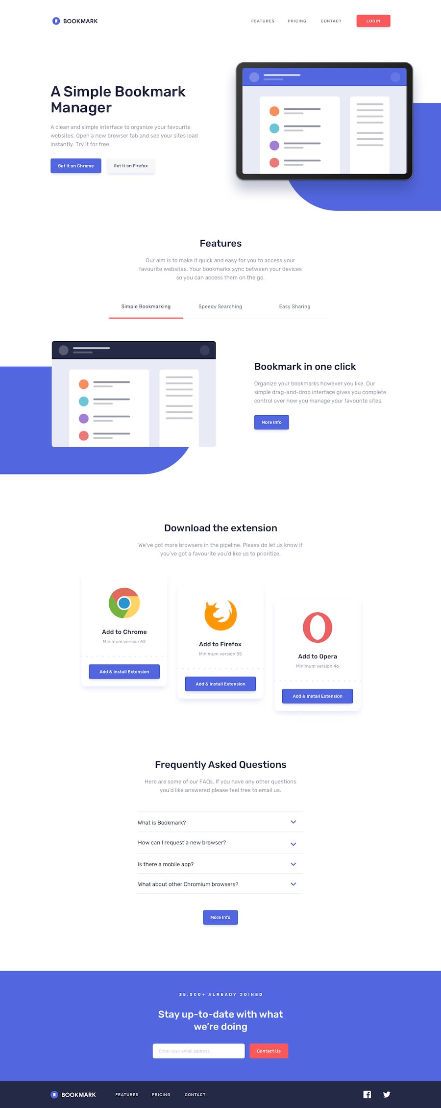
Desktop design screenshot for the Bookmark landing page coding challenge

This is a solution for...

  • HTML
  • CSS
  • JS
3intermediate
View challenge

Design comparison


SolutionDesign

Solution retrospective


this is the mobile version of the site .. please go through and tell me what you think... the mobile version has been corrected i have now added the desktop version please check that also and tell me what you think

Community feedback

Greta 340

@gretagr

Posted

Hi, you did an amazing job so far!

I have some ideas about how you could improve your project:

The website has a horizontal scroll when viewing on the mobile. I think fixed body size is the reason for that (width: 405px). Also, you should always use the <meta> viewport element for responsive websites to avoid this kind of problem.

The second one is absolutely a matter of taste: background for the menu (when active) could be less transparent so that the site beneath it wouldn't distract viewers' eyes so much.
0

Please log in to post a comment

Log in with GitHub
Discord logo

Join our Discord community

Join thousands of Frontend Mentor community members taking the challenges, sharing resources, helping each other, and chatting about all things front-end!

Join our Discord