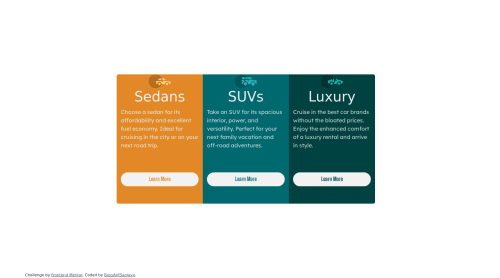
html, css, bootstrap

Solution retrospective
how do you set the container so that its position is centered horizontally and vertically? how to make the container to be responsive correctly?
Please log in to post a comment
Log in with GitHubCommunity feedback
- @iamsomraj
Hi,
To center a container both horizontally and vertically using flexbox in CSS, you can apply the following styles to the container:
.container {
display: flex;
justify-content: center; /* Centers horizontally */
align-items: center; /* Centers vertically */
height: 100vh; /* Set the container height to the full viewport height for vertical centering */
}
By using
display: flex, the child elements inside the container will be automatically centered both horizontally and vertically.This approach centers the container's content regardless of screen size, making it responsive to various devices.
I can see that you have used bootstrap. Personally, I would highly recommend using Tailwind. Let me know if you need any help.
- @gabrieltrt
Friend, in the mobile version you need to use the flex-direction:column; property in the main container.
And when you do media queries, you must change the main container's flex-direction property to Row instead of column.
in short, study more about flexbox! he will solve pretty much everything in this challenge.


Join our Discord community
Join thousands of Frontend Mentor community members taking the challenges, sharing resources, helping each other, and chatting about all things front-end!
Join our Discord