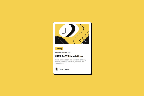
Submitted about 1 year agoA solution to the Blog preview card challenge
HTML, CSS, Display Flex

@AbdulrahmanFa2hy
Code
Please log in to post a comment
Log in with GitHubCommunity feedback
- @Raptor0x1
- First of all, don't keep your focus on just the component think of the bigger picture here, when this component is going to be used in blog websites there's going to be multiple components similar to this one.
- Keeping the first point in mind, you can use min-height instead of height in the body. In a website there's going to be more content after this component
min-height: 100vhmakes the screen scroll if there's more content than the viewport height without overflowing. So it's better to use min-height. - Instead of absolute units (px) use relative units such as rem.
- You can use
marginto create some space between the screen and card in mobile view. - There is no need to use
buttonelement. In most of the websites cards are sorted using these tags in this case it is learning. They use javascript to do this. What I'm trying to say is learning is not a button just text, so use<p>,<span>or simply write this in a new div. - Instead of using Next-Sibling Combinator
h2 + pyou could have given a class to each element. Moving forward you will have to create larger projects and using these combinators will make things messy. Use classes instead. - Lastly, You haven't done the active states of the card.
Marked as helpful - @skyleranglh
Looks good


Join our Discord community
Join thousands of Frontend Mentor community members taking the challenges, sharing resources, helping each other, and chatting about all things front-end!
Join our Discord