HTML, CSS, Grid, Responsive

Solution retrospective
Hi guys,
This is my second attempt.
I'm messing up with the code to make it more similar, but I am perplexed about these things:
-
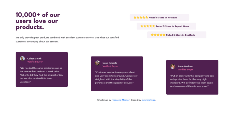
The first section: the title "10,000 ....". How to make it more identical to the example? as I added the <br/> to make it the same. I make a grid between the "10,000" title and star review by 50% and 50%.
-
The card deck. There're two issues here: a. How to add the space between the card? Mine is larger than the example, I tried to add the margin, but it doesn't work. b. When it comes to mobile view, the space between the cards gets larger. Guess it's the same with above T_T. Help me....
So, any advice or suggestions would be appreciated. TIA 😊😊😊
Please log in to post a comment
Log in with GitHubCommunity feedback
No feedback yet. Be the first to give feedback on threshold's solution.
Join our Discord community
Join thousands of Frontend Mentor community members taking the challenges, sharing resources, helping each other, and chatting about all things front-end!
Join our Discord