


Szymon Rojek• 4,540
@SzymonRojek
Posted
Hi Mike,
Welcome here! Well done :D
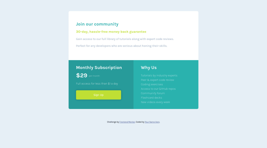
I've just checked your HTML structure and preview site by the inspector. A few tips from me:
- you have used so many divs in your project. Divs are semantically inert elements — elements that don’t really do or say anything, of course, they are important too. I'd recommend reading more about semantic tags;
- headings: just to let you know, you should only use one h1 per page. Using more than one will not result in an error, but using only one is seen as a best practice. It makes logical sense => h1 is the most important heading, and tells you what the purpose of the overall page is (or component in this single page). Of course, you have used the h1 => 29 dollars per month but I'd recommend to change it. Look at the context of your component and let me know what do you think about it => please check this article;
- button: we can also use a link here. I can recommend this post from the blog CSS-tricks: A Complete Guide to Links and Buttons;
- in the last card instead of br it is better to use ul > li (unordered list & list item);
- remove the CSS styles and transfer them to the CSS file;
- I think the bg-color of the third card is a little bit too strong;
- on mobiles margin / padding are too width (check it out on your browser by the inspector - you can easily check responsiveness on different devices, it helps a lot);
- add overflow: hidden; (eliminate the scroll - we don't it here);
- reset the CSS styles:
* {
  margin: 0;
  padding: 0;
  box-sizing: border-box;
}
- have a try to start to build the project from mobile-first (I think it is better than desktop-first);
That's it from me. Ps. don't forget to upvote any comments on here that you find helpful.
Many greetings :D
2
