


Hi Matt On mobile I think you need to resize and reposition the bg images. Maybe hide overflow too as I can scroll offscreen in both axis/directions at the moment.
Looking at the html I have 2 suggestions:
- leave some of those alt attributes empty so assistive tech knows to skip over them if they're not meaningful, otherwise add much clearer descriptions that would make sense if you couldn't see the image.
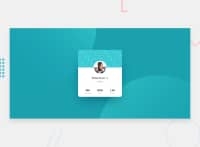
- in your table markup, the followers etc would have to be the <th> elements semantically. 80k doesn't make sense as a heading, but followers does. You can still have them in that order, or you can use css to reverse the rows, but the bottom row (as it stands at the moment) should be the table headers.
Hope all that's helpful, keep on coding ☺
@Mattvp21
Posted
Hi @grace-snow,
Thanks for the suggestion on the tables. I just turned the top row into table data lines and adjusted the font in CSS. Looks great. Working on the bubbles. I just started a bootcamp a couple of weeks ago and I don't quite have the mobile side down. Is there anything I need besides VsCode to make it optimal on mobile? Thanks again for your help!
Nope nothing in particular, just use dev tools a lot (I like to have dev tools on the side so it's easier to frow/shrink the viewport width.
You'll find all easier once you start building from mobile design first and working up from there. That habit builds over time


