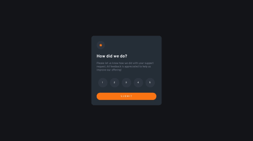
Submitted almost 2 years agoA solution to the Interactive rating component challenge
html, css, javascript

@Meetkamal256
Solution retrospective
Any feedback on how to improve my code
Code
Please log in to post a comment
Log in with GitHubCommunity feedback
- @MartinXCVI
Hello Kamal; it looks good. Perhaps a way of improving it would be to round the buttons with "em" instead of using percentages so it looks perfectly spheric. Also being more specific with flex-box in order to fit the child element exactly in the middle of its parent element. There is a small space to the right which can be noticed if you pay close attention to it. I hope this helps!
Marked as helpful

Join our Discord community
Join thousands of Frontend Mentor community members taking the challenges, sharing resources, helping each other, and chatting about all things front-end!
Join our Discord