


Micah Ishengoma• 150
@coderMicah
Posted
Thanks for the feedback.....I appreciate the snippet I'll work on the sizing issues
0
Looking to hire developers?
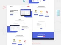
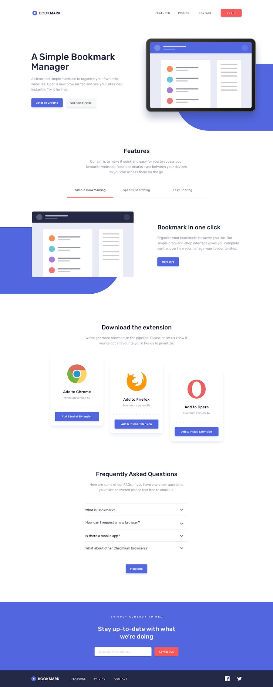
Hi everyone, just accomplished this challenge but could not make the blue background using code and changing the svg fill to white . Please help.
Your reviews means a lot to me.....
@coderMicah
Posted
Thanks for the feedback.....I appreciate the snippet I'll work on the sizing issues
@pikapikamart
Posted
Hey, great work on this one. The layout in desktop is fine, though there are missing like what you said, the blue background, for the mobile view it is fine as well, but there are issues when resizing the layout to reach the mobile state.
Suggestions would be that:
showcase selector have a position: relative, then create its showcase::before and that is where you will place the blue background. I tweak it a bit and came with this snippet content: "";
position: absolute;
right: -4rem;
width: 40rem;
height: 20rem;
background-color: blue;
z-index: -1;
bottom: 0;
border-bottom-left-radius: 14rem;
You could try this one and see how it goes. Then you could just adjust it if you need to and also applying it on the next blue background at the bottom part.
Adjusting the whole padding of the layout. Right now, the paddings are too little and making the layout look like spread. Adjusting it more like in the original will be really awesome.
On your cards section, I recommend not using vh unit on the height of the container. If you resized the browser, you will see that the layout shifts because it is relative, to the remaining visible part of the screen or the browser. Instead, use rem to make it fixed or let the elements inside that selector create the dimension it needs and just add a padding to the top and bottom of it.
On your newsletter section as well, not recommend using vh units. Use rem or allow the content.
On the newsletter section as well, the inputs, they need to be wrapped inside a form element. That submits right, so it is intended for it to be nested inside form tags and not just div. Also the "contact us" button next to it, it needs to be button and not a tags, making it button will make it submit the form if it passed somehow a verification.
On the footer section, the social media icons needs to be wrapped inside a tags, since they are links right, nesting them in a tags is good.
Resizing issues:
On the hero section, the two buttons/links are now overlapping each other, and the "get it on firefox"'s text are now wrapped in another row.
Adding overflow: hidden on the hero section will prevent the scrollbar at the bottom, which is caused by the hero's image width overlapping the container's width.
On your bookmark section, the text are narrow because the image next to it doesn't really scale on the resize.
The extension part on the bottom needs to have margin so that the 3 extensions are not really touching each other.
On the footer, your ul doesn't really respond well thus making the content overlaps it and creating again another scrollbar at the bottom.
It might be a lot, but checking those will be really great. But still, good job on this one^^
Join thousands of Frontend Mentor community members taking the challenges, sharing resources, helping each other, and chatting about all things front-end!
Join our Discord
