Not Found
Not Found
Request path contains unescaped characters
Not Found
Not Found
Not Found
Not Found
Not Found
Not Found
Not Found
Not Found
Not Found
Not Found
Not Found
Not Found
Not Found
Not Found
Not Found
Not Found
Not Found

Submitted

HTML CSS JS

Prajwal Gautam• 190

@prajwal18

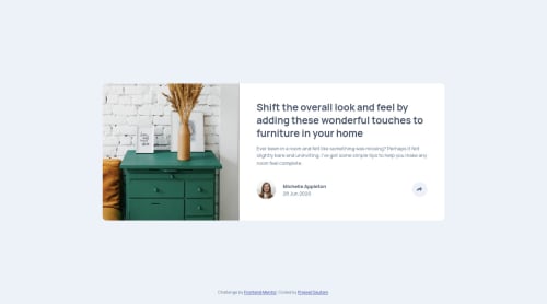
Desktop design screenshot for the Article preview component coding challenge

This is a solution for...

  • HTML
  • CSS
  • JS
1newbie
View challenge

Design comparison


SolutionDesign

Solution retrospective


Can someone review my work and give feedback, best practices, how you would do certain aspects differently. Any feedback would be highly appreciated.

Community feedback

Raymart Pamplona• 16,090

@pikapikamart

Posted

Hey, really great work on this one. Layout in desktop looks really good, responds well and the mobile layout looks good as well.

Some suggestions would be:

  • Using h1 on the topic title of the person's testimonial? blog? I don't know what that is but it is certainly from the person itself. Since in a real website, this would be like a mini component, an h1 on it is not really suited. Maybe an h2 for this one, the h1 would be a screen-reader only text, it will have a sr-only class, you can search up the net for some css stylings of that one, or you could reply in here and I can help and explain it as well :>
  • The person's name as well the date shouldn't be using ul element, since those are not really list items. The person's name should be a heading tag, while the date is just p tag.
  • The toggle on the right side should be using button element. An interactive component needs to use interactive element.
  • The button as well should have an aria-expanded attribute on it. This will inform the user if the button has expanded something. The code will look like:
html :
 <button aria-expanded="false" aria-label="social media popup" />

javascript:
 if ( button is clicked ) {
    button.setAttribute("aria-expanded", "true");
} else {
  button.setAttribute("aria-expanded", "false");
}

The aria-label informs the user that this button is for a popup for the social media.

  • Those social media links should be inside their own a tag since those are links. The links will be wrapped inside a ul element, since those will be "list" of social media links.
  • Each a tag that wraps the social media should have an aria-label and the value points to the name of the social media they wrap. For facebook a tag, it should have aria-label="facebook", this way, users will know that this link would take them to facebook.
  • The img being used for the social media should have used alt="" and aria-hidden="true", since those images are just decoration, you should always hide them by applying those.

Aside from those, really great job on this one. If you have questions about on what I stated, just drop it here and I can help with it.

Marked as helpful

1

Prajwal Gautam• 190

@prajwal18

Posted

@pikamart That was very insightful. Half of the stuff you wrote like aria-label i have no idea about. I will have to look into it more deeply and write back to you. Thanks for taking the time to write in so much detail.

0
Dharmik_487• 1,740

@Dharmik48

Posted

Hello,

Your solution is really good! Just one thing should add is a cursor: pointer; to the share button and if possible some hover effect too.

Rest of the site is really great!

0

Prajwal Gautam• 190

@prajwal18

Posted

@Dharmik48 Thanks for the reminder, I forgot about that cursor

0

Please log in to post a comment

Log in with GitHub
Discord logo

Join our Discord community

Join thousands of Frontend Mentor community members taking the challenges, sharing resources, helping each other, and chatting about all things front-end!

Join our Discord