HTML, CSS, JS, Mobile First Rocks

Solution retrospective
Dear All,
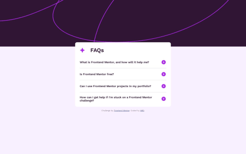
Here is my next challenge, another faq accordion. I found mobile first much more convenient, it hardly needs any media queries which is great. However, my biggest issue was the background image. I reall wanted the desktop background image to not shrink with the screen size, but I just wasn't able to do that. Could anyone help me out with that?
Cheers to you all,
Dalma
Please log in to post a comment
Log in with GitHubCommunity feedback
- P@Deanogit
Hi @bdal90
Great job completing this challenge
I took a look at your code in chrome dev tools and experimented with the background-image.
I found by removing the
background-size: contain;
&
background-position: 0 3rem;
on the
@media (min-width: 375px) body {}class,the background no longer shrinks in height when the screen width is wider than 375px.
I hope this helps

Join our Discord community
Join thousands of Frontend Mentor community members taking the challenges, sharing resources, helping each other, and chatting about all things front-end!
Join our Discord