
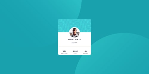
Solution retrospective
Hello, everyone! I've accomplished this challenge only for desktop resolution, I'm still confused how I can make it for mobile phone size. Should I use media query?
Any advice or recommendation will be highly appreciated!
Code
Please log in to post a comment
Log in with GitHubCommunity feedback
- @Rabin92
Hey @Sophia,
Congratulations on completing your first challenge!
I took a look at your site and currently, it's looking great on all screen devices. It's not breaking in any form. However, if you would like to learn about responsive design, you can check out the following resources on
CSS Grid, FLexbox & Media queries.- https://css-tricks.com/snippets/css/complete-guide-grid/ - CSS Grid
- https://css-tricks.com/snippets/css/a-guide-to-flexbox/ - Flexbox
- https://www.w3schools.com/css/css_rwd_mediaqueries.asp - Media Queries
Hope this helps!

Join our Discord community
Join thousands of Frontend Mentor community members taking the challenges, sharing resources, helping each other, and chatting about all things front-end!
Join our Discord