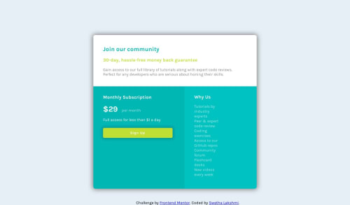
Not Found
Not Found
Not Found
Not Found
Not Found
Not Found
Not Found
Not Found
Not Found
Not Found
Not Found
Not Found
Not Found
Not Found
Not Found
Not Found
Not Found
Not Found
Not Found
Not Found

Submitted

HTML, CSS, Mobile Responsive, Media Queries

@swethalakshmi22

Desktop design screenshot for the Single price grid component coding challenge

This is a solution for...

  • HTML
  • CSS
1newbie
View challenge

Design comparison


SolutionDesign

Solution retrospective


I often get confused with how different people write different code for the same result. Is there an only one way of writing code for an specific output or is there multiple ways of writing code for that same output. If suppose there are multiple ways is there an specific way in that which is an preferred way.

And I would appreciate any type of feedback on my code.

Community feedback

@gabysantosw

Posted

Good job there! And yes, there's MANY ways to achieve the same output. For example: some people might use flexbox or css grid or none at all and get to the same result. So it all depends! IMO the best code is the one that you can understand when you see it later on (:

A couple of tips I can give you: practice using a fixed with and a max-width: 100% to build more responsive websites. I see that you used 50% as the width for the container, that works on medium screens but on huge ones is too big and on smaller ones is too small and it breaks the other parts. The other one would be to use flexbox to center it on the page instead of setting the margins manually.

Keep it up, its all about practice!

1

@swethalakshmi22

Posted

Thank you for your feedback and I will try these tips the next time.

0

Please log in to post a comment

Log in with GitHub
Discord logo

Join our Discord community

Join thousands of Frontend Mentor community members taking the challenges, sharing resources, helping each other, and chatting about all things front-end!

Join our Discord