Not Found
Not Found
Not Found
Not Found
Not Found
Not Found
Not Found
Not Found
Not Found
Not Found
Not Found
Not Found
Not Found
Not Found
Not Found
Not Found
Not Found
Not Found
Not Found
Not Found

Submitted

HTML, CSS ONLY

@MohitMahara

Desktop design screenshot for the Product preview card component coding challenge

This is a solution for...

  • HTML
  • CSS
1newbie
View challenge

Design comparison


SolutionDesign

Community feedback

Lucas 👾 104,560

@correlucas

Posted

👾Hello @MohitMahara, Congratulations on completing this challenge!

Your solution its almost done and I’ve some tips to help you to improve it:

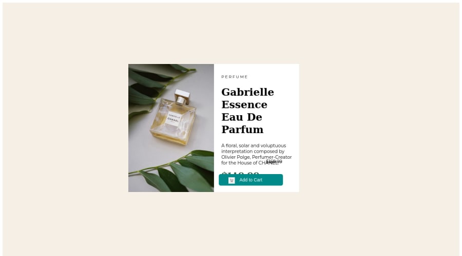
1.Improve the card's overall look by adding the rounded borders to the component and also the image using border-radius: 15px

  • Add rounded borders to the left side of the image with border-radius: 15px 0px 0px 15px;
  • Then do the same thing for the component but in the opposite borders border-radius: 0px 15px 15px 0px;

2.A better way to work this solution image, the product image is by using <picture> to wrap it on the html instead of using it as <img> or background-image (with the css). Using <picture> you wrap both images (desktop and mobile) and have more control over it, since you can set in the html when the images changes setting the screen size for each image.ote that for SEO / search engine reasons isn’t a better practice import this product image with CSS since this will make it harder to the image.

Here’s the documentation and the guide to use this tag: https://www.w3schools.com/tags/tag_picture.asp

See the example below:

<picture>
  <source media="(max-width:650px)" srcset="./images/image-product-mobile.jpg">
  <img src="./images/image-product-desktop.jpg" alt="Gabrielle Parfum" style="width:auto;">
</picture>

👨‍💻Here's my solution for this challenge if you wants to see how I build it: https://www.frontendmentor.io/solutions/product-preview-card-vanilla-css-and-custom-hover-state-on-hero-85A1JsueD1

✌️ I hope this helps you and happy coding!

0

@NIk22517

Posted

Hello @MohitMahara, Congratulations on completing this challenge!

Nice code and nice solution! You did a good job here putting everything together. I’ve some suggestions for you:

You have used background-image instead of using background-image you can use

<picture>
          <source
            srcset="mobile.jpg"
            media="(max-width: 620px)"
          />
          <img
            src="desktop.jpg"
            alt="Office Workers Smiling"
          />
        </picture>

Improve the semantics by replacing the <div> and using <section> which is a better tag, remember that <div> doesn’t have any practical meaning is just a block of elements, so for a big block of elements use semantic tags.

This is a good resource to understand more about semantic tags: https://www.w3schools.com/html/html5_semantic_elements.asp

when you style your page try using this

*{
margin: 0;
padding: 0;
}

to remove the padding and margin to thebody

And for responsiveness try using

@media (max-width: 600px) {
//add the class or tag here 
}

✌️ I hope this helps you and happy coding!

0

@VCarames

Posted

Hey @MohitMahara, some suggestions to improve you code:

  • Your content isnt responsive at all. This article will teach how to:

https://web.dev/learn/design/

  • Apply the background color to the Body Element.

  • When using images that are different size for different breakpoints, its’ far more effective to use the <picture> element. By using this element not are able to use different size images, you can also save on bandwidth, meaning your content loads faster.

Syntax:

  <picture>
    <source media="(min-width: )" srcset="">
    <img src="" alt="">
  </picture>

Source:

https://www.w3schools.com/html/html_images_picture.asp

https://web.dev/learn/design/picture-element/

  • The old price isnt being announce properly to screenreaders. You want to wrap it in a Del Element and include a sr-only text explaining that this is the old price.

  • To make it easier to deal with CSS , have more control over your content, and ensure that your content will look the same regardless of browser used I suggest using CSS Resets.

Here are few CSS Resets that you can look at and use to create your own CSS Reset or just copy and paste one that already prebuilt.

https://www.joshwcomeau.com/css/custom-css-reset/

https://meyerweb.com/eric/tools/css/reset/

http://html5doctor.com/html-5-reset-stylesheet/

Happy Coding!

0

Please log in to post a comment

Log in with GitHub
Discord logo

Join our Discord community

Join thousands of Frontend Mentor community members taking the challenges, sharing resources, helping each other, and chatting about all things front-end!

Join our Discord