
Code
Please log in to post a comment
Log in with GitHubCommunity feedback
- P@willdelorm
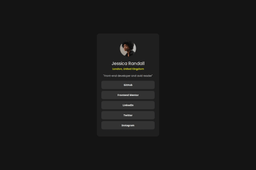
Your solution looks pretty good! Organization and sizing look spot on.
Make sure to check the style guide! The color for the location text as well as specific font weights are mentioned there. It's important, especially when working with clients, to match the style guide as close as possible.
I also noticed that you are missing the hover/focus styling. Check the active-states.jpg image under the design folder for what it should look like. If you aren't familiar, this is a good example of using pseudo-classes in your code.

Join our Discord community
Join thousands of Frontend Mentor community members taking the challenges, sharing resources, helping each other, and chatting about all things front-end!
Join our Discord