Skip to content
  • Unlock Pro
  • Log in with GitHub
Solution
Submitted over 1 year ago

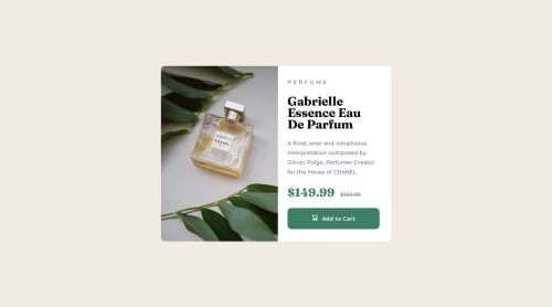
HTML, CSS, Responsive design

Mehrdad Kordi•40
@Dollarage
A solution to the Product preview card component challenge
View live sitePreview (opens in new tab)View codeCode (opens in new tab)

Solution retrospective


What are you most proud of, and what would you do differently next time?

I did the desktop design of the page very fast, but I got stuck on the responsive mobile part. I had to experiment with styles in order to make the page responsive.

What challenges did you encounter, and how did you overcome them?

Setting styles for responsive mobile version was a bit challenging but I managed to make a mobile version.

What specific areas of your project would you like help with?

If you know some good study and practice material about responsive web design please introduce them to me. Thank you for reading this!

Code
Select a file

Please log in to post a comment

Log in with GitHub

Community feedback

  • Bienvenue•220
    @bienvenudev
    Posted over 1 year ago

    Hello!

    Congrats.

    Here are a few suggestions that might make things even better:

    • You don't need to change the width of the body.
    • Try to make this responsive on all screen sizes
    • Including a modern CSS reset at the beginning of your styles can help normalize browser defaults and provide a clean foundation for your project. Check out this article: https://www.joshwcomeau.com/css/custom-css-reset/
    • Avoid setting font-sizes in px, use rem instead.(https://www.joshwcomeau.com/css/surprising-truth-about-pixels-and-accessibility/#accessibility-considerations-5).
    • Instead of setting a fixed width on your main, consider using max-width in REM units. This allows the card to adapt to different screen sizes while maintaining its layout.
    • Similar to width, avoid setting a fixed height on your main.This ensures the content can adjust to different content lengths.

    Additional resources:

    • Check out Grace's walkthrough: https://fedmentor.dev/posts/html-plan-product-preview/

    • Kevin Powell's Video on CSS Units: https://www.youtube.com/watch?v=N5wpD9Ov_To (please subscribe to his YT channel and check out his other videos) +

    • A free course on building responsive layouts (https://courses.kevinpowell.co/conquering-responsive-layouts)

    I hope these tips and resources are helpful! Feel free to connect and ask any questions you might have.

    Marked as helpful

Join our Discord community

Join thousands of Frontend Mentor community members taking the challenges, sharing resources, helping each other, and chatting about all things front-end!

Join our Discord

Stay up to datewith new challenges, featured solutions, selected articles, and our latest news

Frontend Mentor

  • Unlock Pro
  • Contact us
  • FAQs
  • Become a partner

Explore

  • Learning paths
  • Challenges
  • Solutions
  • Articles

Community

  • Discord
  • Guidelines

For companies

  • Hire developers
  • Train developers
© Frontend Mentor 2019 - 2025
  • Terms
  • Cookie Policy
  • Privacy Policy
  • License

Oops! 😬

You need to be logged in before you can do that.

Log in with GitHub

Oops! 😬

You need to be logged in before you can do that.

Log in with GitHub

How does the accessibility report work?

When a solution is submitted, we use axe-core to run an automated audit of your code.

This picks out common accessibility issues like not using semantic HTML and not having proper heading hierarchies, among others.

This automated audit is fairly surface level, so we encourage to you review the project and code in more detail with accessibility best practices in mind.

How does the CSS report work?

When a solution is submitted, we use stylelint to run an automated check on the CSS code.

We've added some of our own linting rules based on recommended best practices. These rules are prefixed with frontend-mentor/ which you'll see at the top of each issue in the report.

The report will audit all CSS, SCSS and Less files in your repository.

How does the HTML validation report work?

When a solution is submitted, we use html-validate to run an automated check on the HTML code.

The report picks out common HTML issues such as not using headings within section elements and incorrect nesting of elements, among others.

Note that the report can pick up “invalid” attributes, which some frameworks automatically add to the HTML. These attributes are crucial for how the frameworks function, although they’re technically not valid HTML. As such, some projects can show up with many HTML validation errors, which are benign and are a necessary part of the framework.

How does the JavaScript validation report work?

When a solution is submitted, we use eslint to run an automated check on the JavaScript code.

The report picks out common JavaScript issues such as not using semicolons and using var instead of let or const, among others.

The report will audit all JS and JSX files in your repository. We currently do not support Typescript or other frontend frameworks.

Oops! 😬

You need to be logged in before you can do that.

Log in with GitHub