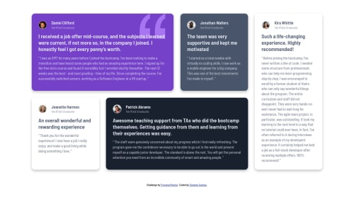
Submitted over 4 years agoA solution to the Testimonials grid section challenge
HTML, CSS, Sass, BEM

@stephenduenas
Solution retrospective
Any feedbacks will be greatly appreciated.
Code
Please log in to post a comment
Log in with GitHubCommunity feedback
- @axevldk
Hi, @Stephen Dueñas ~ I have just studied your work, and it really looks great ~ 👍 Here is tiny opinion on your work.
Cards container is not responsive from 1200px width resolution. I think that's because of fixed width of 275px from
grid-template-columns: 1fr repeat(4, [col-start] 275px [col-end]) 1fr;. I am not sure how to change this style on your case, but it should be solved in my thought.Hope this will help you even a bit ~ Happy coding ~ ✨

Join our Discord community
Join thousands of Frontend Mentor community members taking the challenges, sharing resources, helping each other, and chatting about all things front-end!
Join our Discord